Best Nonprofit Animated Videos of 2026 (June)
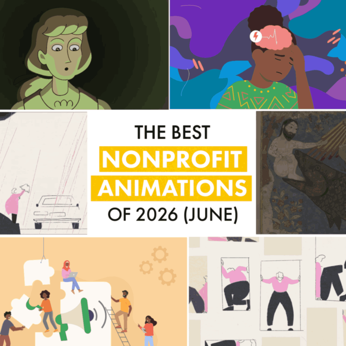
Halfway through 2026 already. Can you believe it? June delivered three nonprofit animations that prove the sector doesn't slow down when summer arrives.
A medical animation about grief that turns out to be more literal than you'd think. An educational animation about poison hiding inside famous paintings. And Leon! Animations finished a nonprofit video for the BAND Foundation about epilepsy treatment gaps across Africa that most people don't even know exist.
One broken heart. One deadly painting. One condition that's treatable but largely ignored. Nonprofits, as always, doing the work that matters.
Best Healthcare Animation
TED-Ed's "How a broken heart affects your body"
Can grief actually kill you? TED-Ed answers yes, and proves the phrase "I can't live without you" isn't just romantic exaggeration. It's sometimes medically literal.
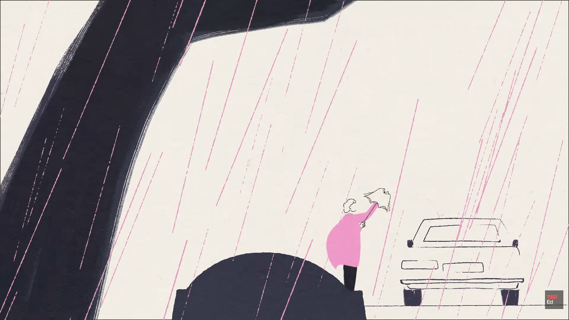
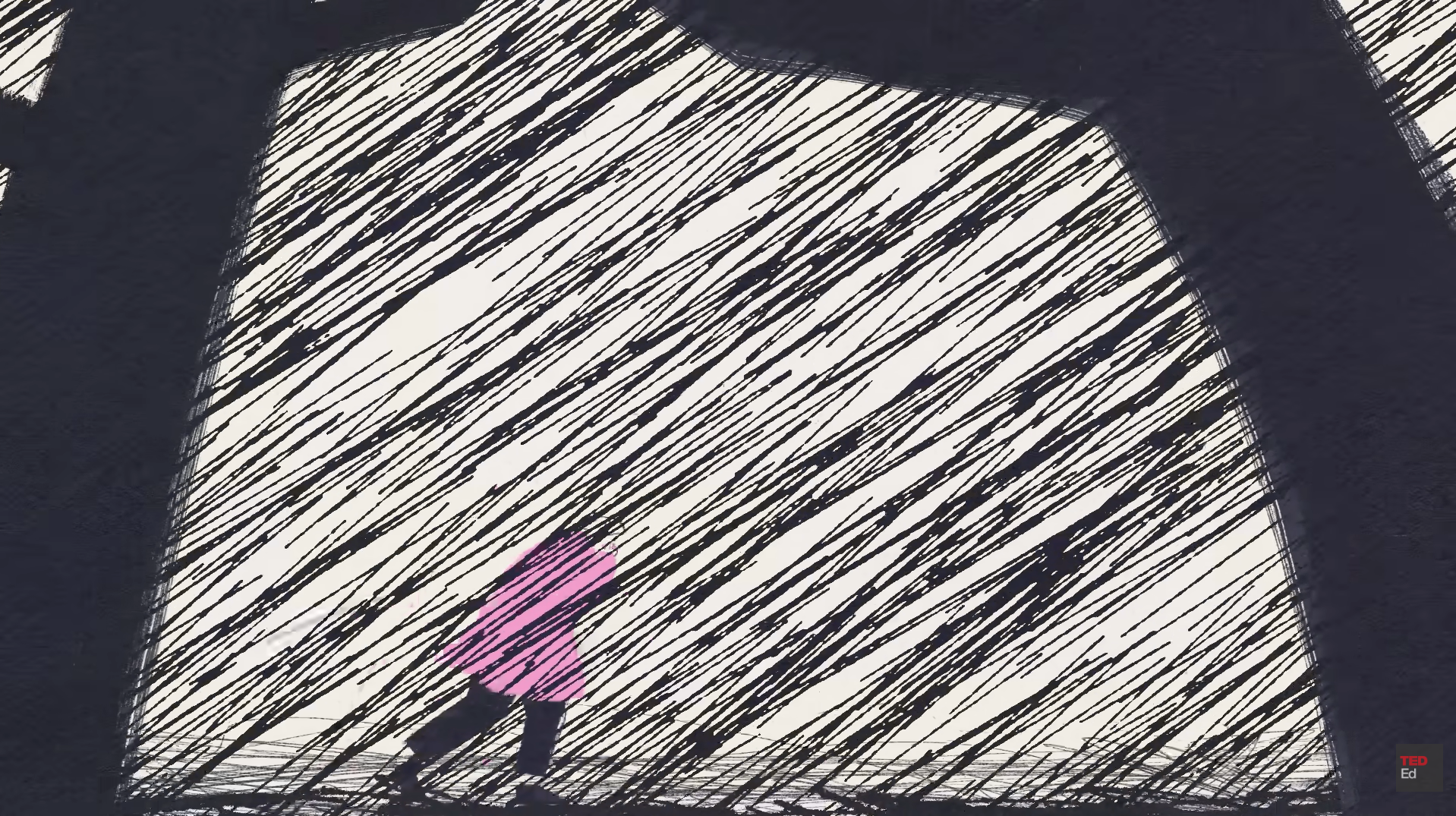
The animation adopts a minimalist, hand-painted aesthetic: rough charcoal strokes, loose linework, paper grain texture throughout. Characters stay simplified while grief does all the visual work through heavy black brushstrokes, chaotic scribbles, looming abstract shapes, and relentless diagonal rain overwhelming the frame.
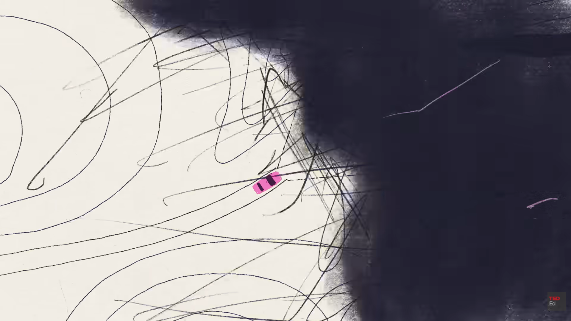
The colour palette mirrors emotional states. Muted warm whites and deep charcoals when establishing context, soft pastels during moments of reflection, darker tones when distress takes over. The composition tightens and opens in response to the emotional weight of the script.
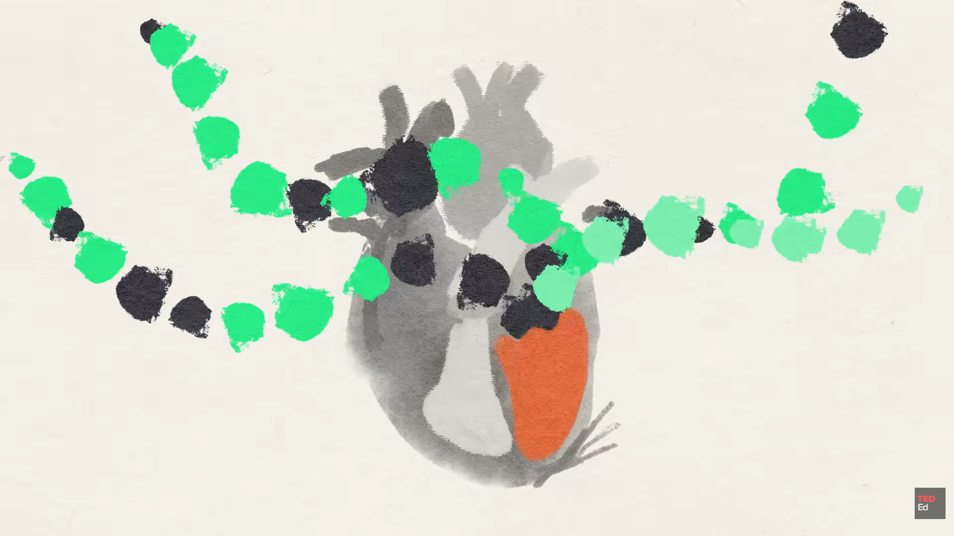
The script follows emotion before science. Widowhood effect: risk of death increases by up to 90% in the first three months after losing a spouse. Then takotsubo cardiomyopathy, the medical condition behind broken heart syndrome, where the heart's left ventricle weakens suddenly. Most recover within weeks, though depression lingers through inflammatory proteins that impair the immune system.
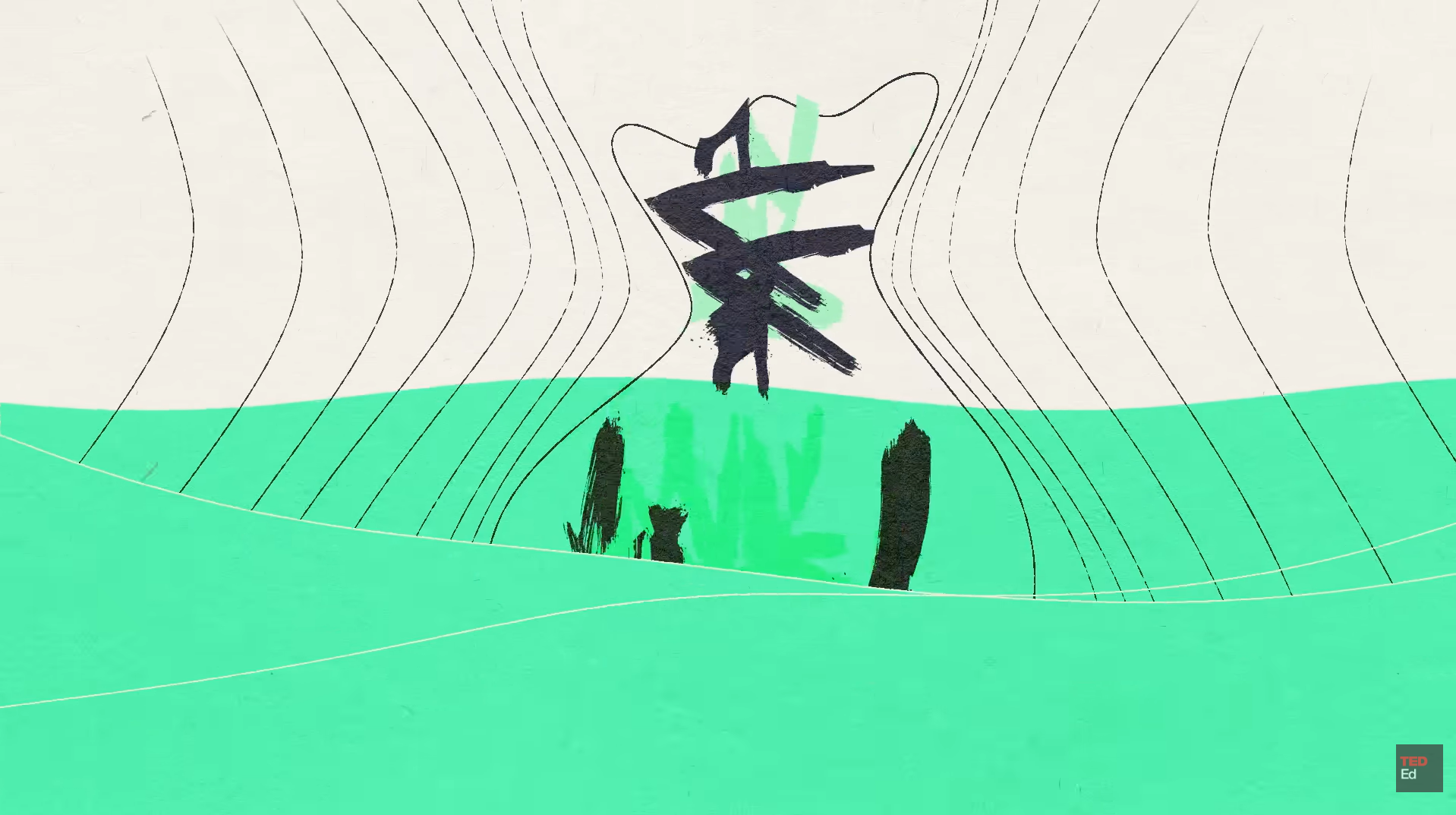
Produced by Compote Collective. Dedicated to Marjane Satrapi, author and filmmaker, whose graphic novel Persepolis remains internationally acclaimed. She died after losing her husband.
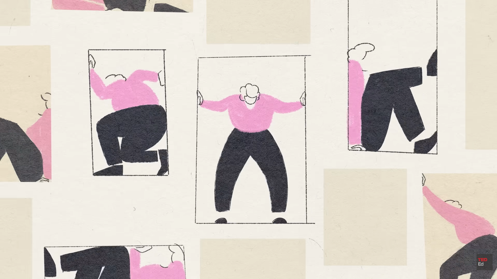
With over 260,000 views, one commenter put it simply: "Much like a broken bone, even a broken heart can heal with time and care." That reframing shifts grief from permanent damage to treatable injury. Which is exactly what a good medical animation does.
Best Educational Animation
The Metropolitan Museum of Art's "Poisonous Colors in Art"
How dangerous can a painting actually be? More than you'd think, and The Met decided to make an educational animation about it.
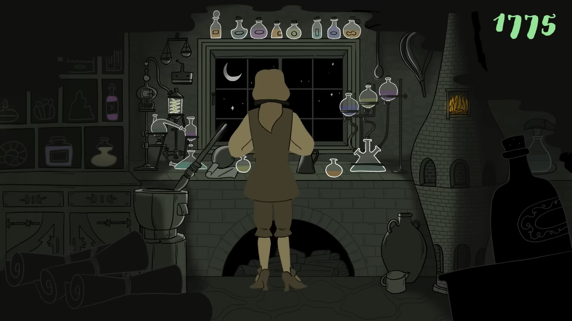
The video takes viewers behind museum conservation to show something most people never consider: centuries-old paintings contain toxic pigments that can genuinely harm you. Beautiful things. Deadly things. Often the same thing.
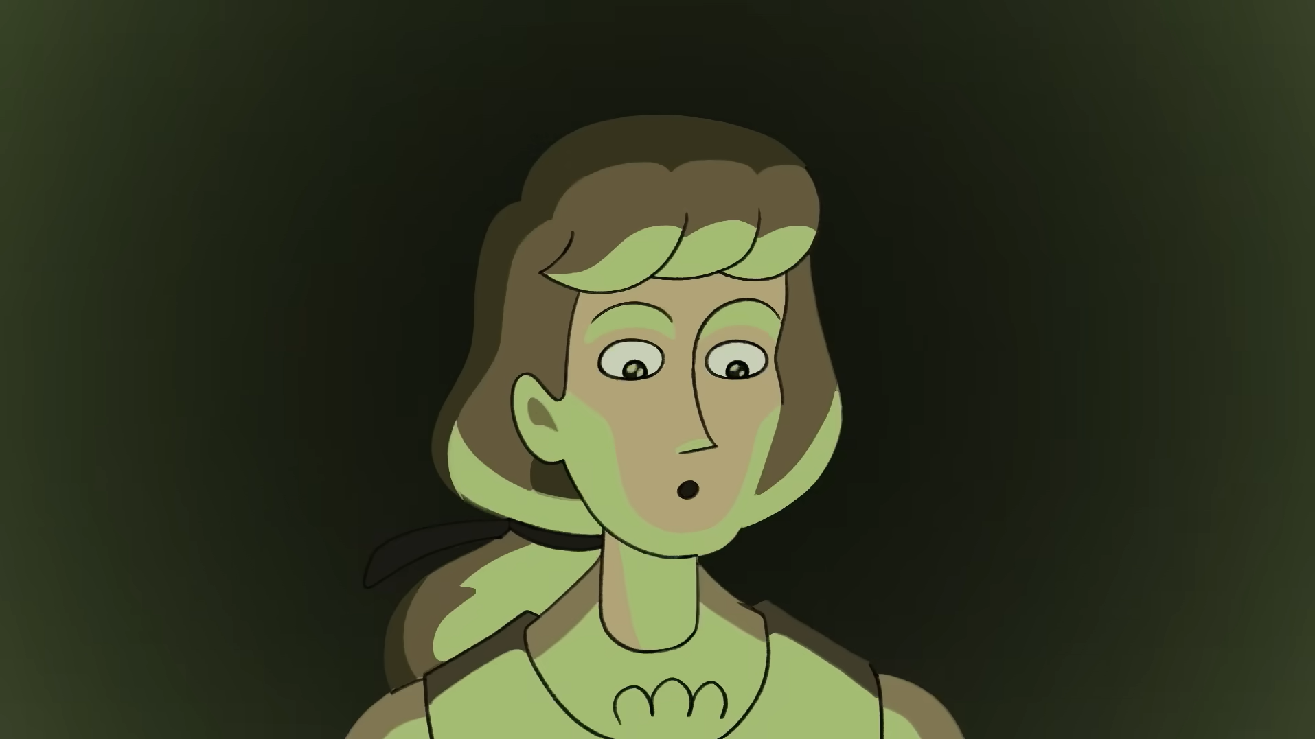
Clean, editorial-style 2D vector animation with flat illustrations, bold outlines, and minimal shading. The camera moves smoothly between historical scenes, laboratory work, and conservation spaces. Authentic historic paintings sit naturally alongside simplified animated characters without feeling out of place.
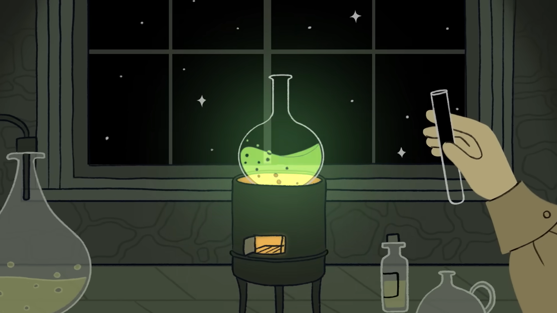
The colour palette is muted: olive greens, earthy browns, charcoal, warm beiges evoking the eighteenth century. Bright emerald green cuts through deliberately, highlighting Scheele's Green and arsenic every time they appear. The green does all the visual work: making danger impossible to miss without resorting to horror.
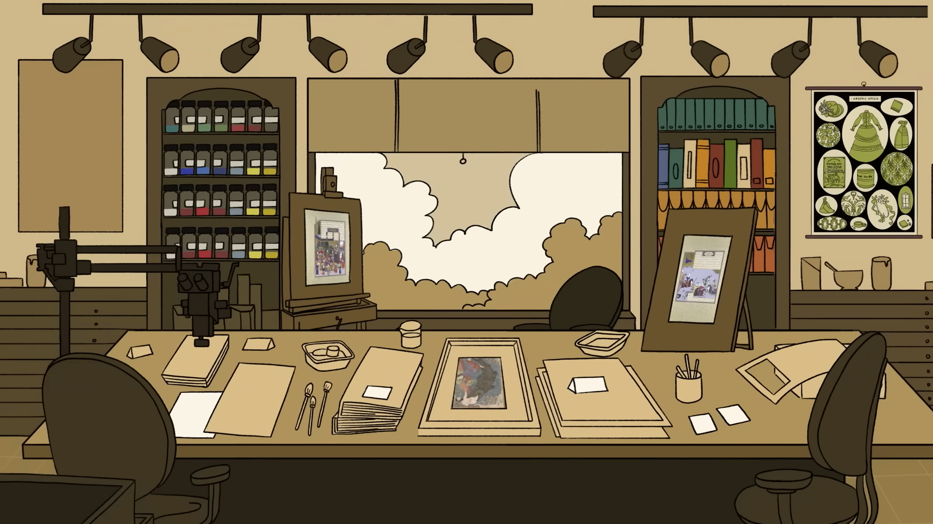
The script opens playfully: "Stay tuned... if you dare." It follows chemist Carl Scheele's story before shifting into The Met's conservation approach. Toxic pigments become "mischievous little monsters." Heavy metals "sound kind of awesome" before the risks land. "How could something so beautiful be so deadly?" The entire video is built around answering that question.
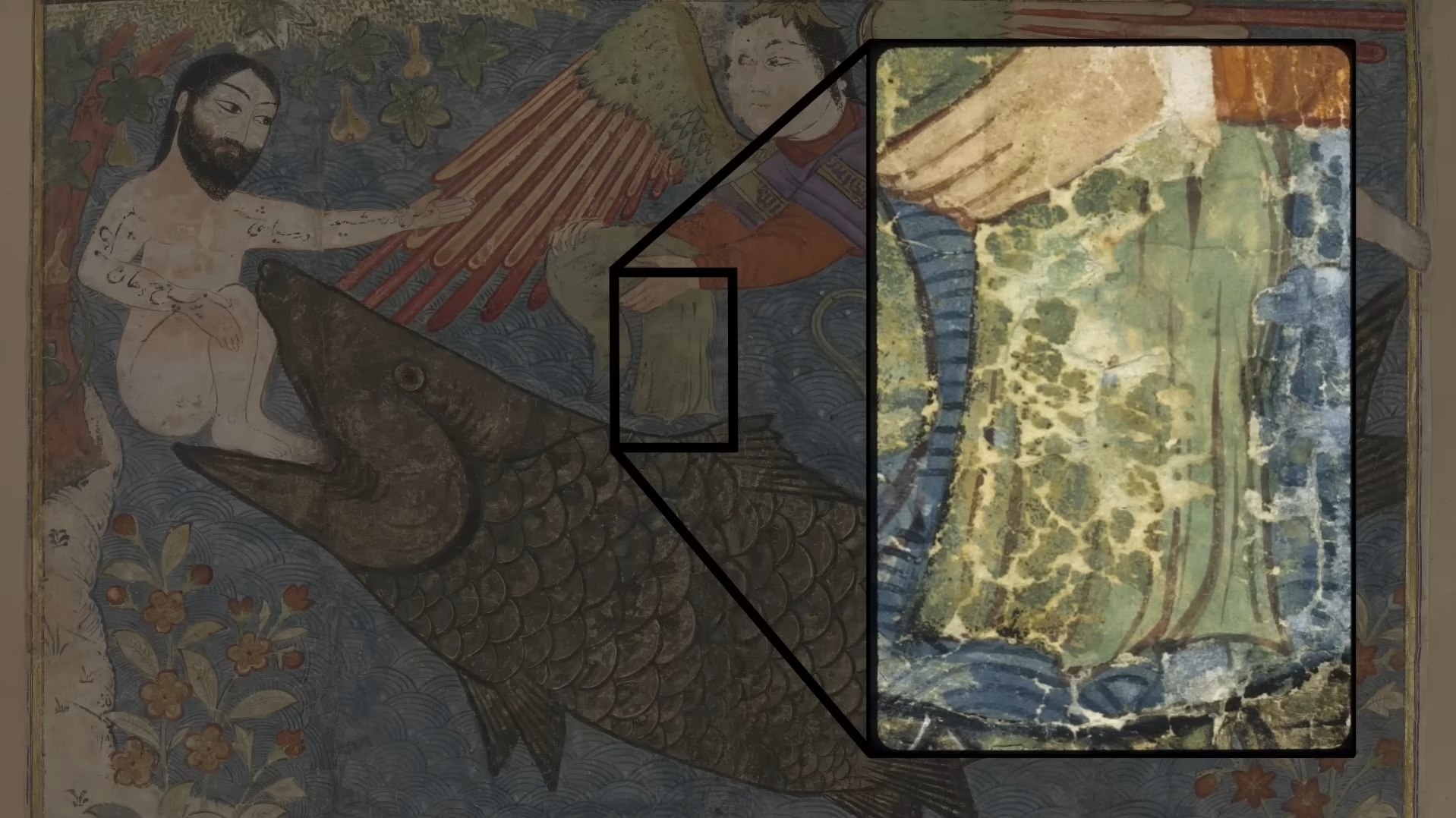
At over 170,000 views, it raises awareness of hidden hazards in historic collections while showcasing why museum conservation is serious, skilled work. Educational animation proving that curiosity and caution aren't opposites.
Best Nonprofit and Healthcare Animation
BAND Foundation's "Epilepsy in Africa"
This one is ours, and we're proud of it.
Honestly, we weren't quite sure whether to call this a nonprofit animation or a healthcare animation. Both feel right. You decide.
The BAND Foundation funds global health initiatives, and this nonprofit animation highlights an epilepsy treatment gap across Africa that most people simply don't know exists.
Over 50 million people worldwide live with epilepsy; over 10 million in Africa. Nearly 80% of those in Africa receive no treatment despite effective medication costing just a few dollars per year. The problem isn't affordability. It's access, stigma, and political will.
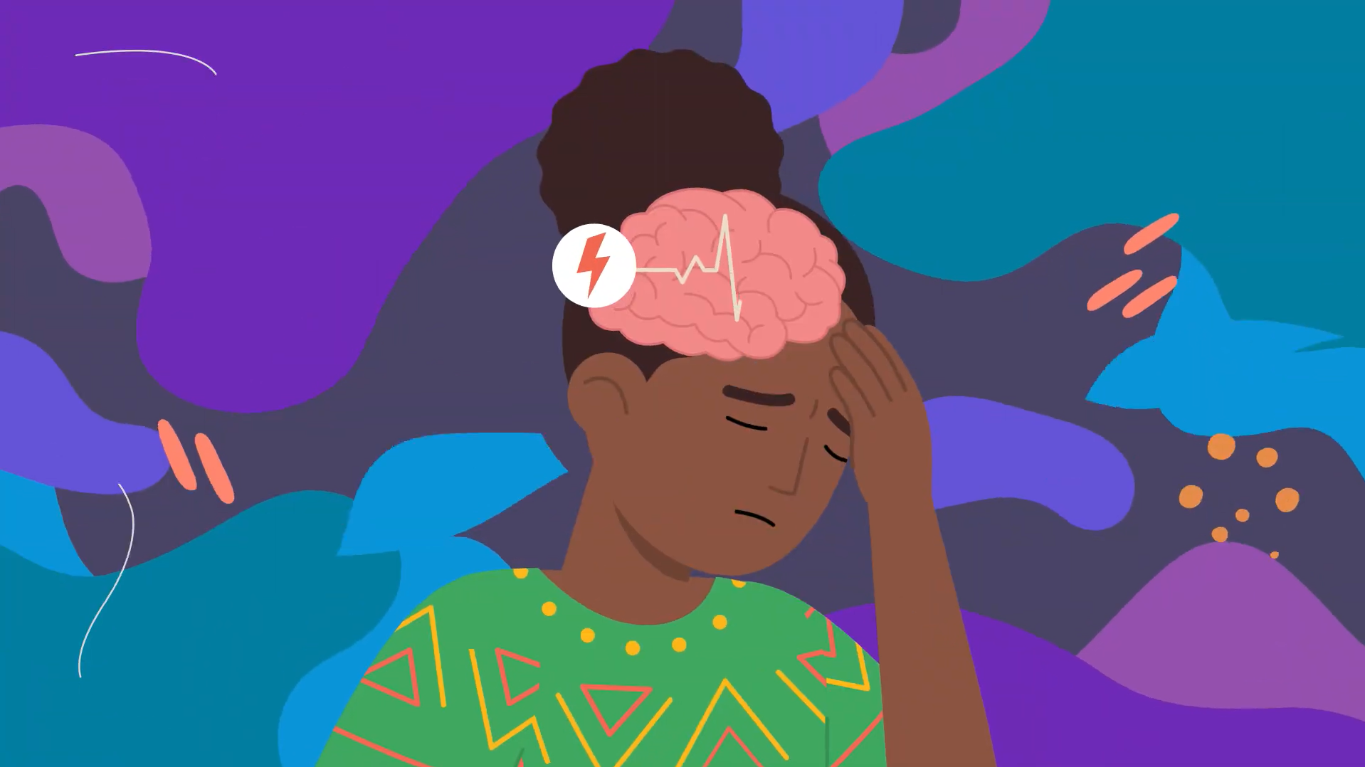
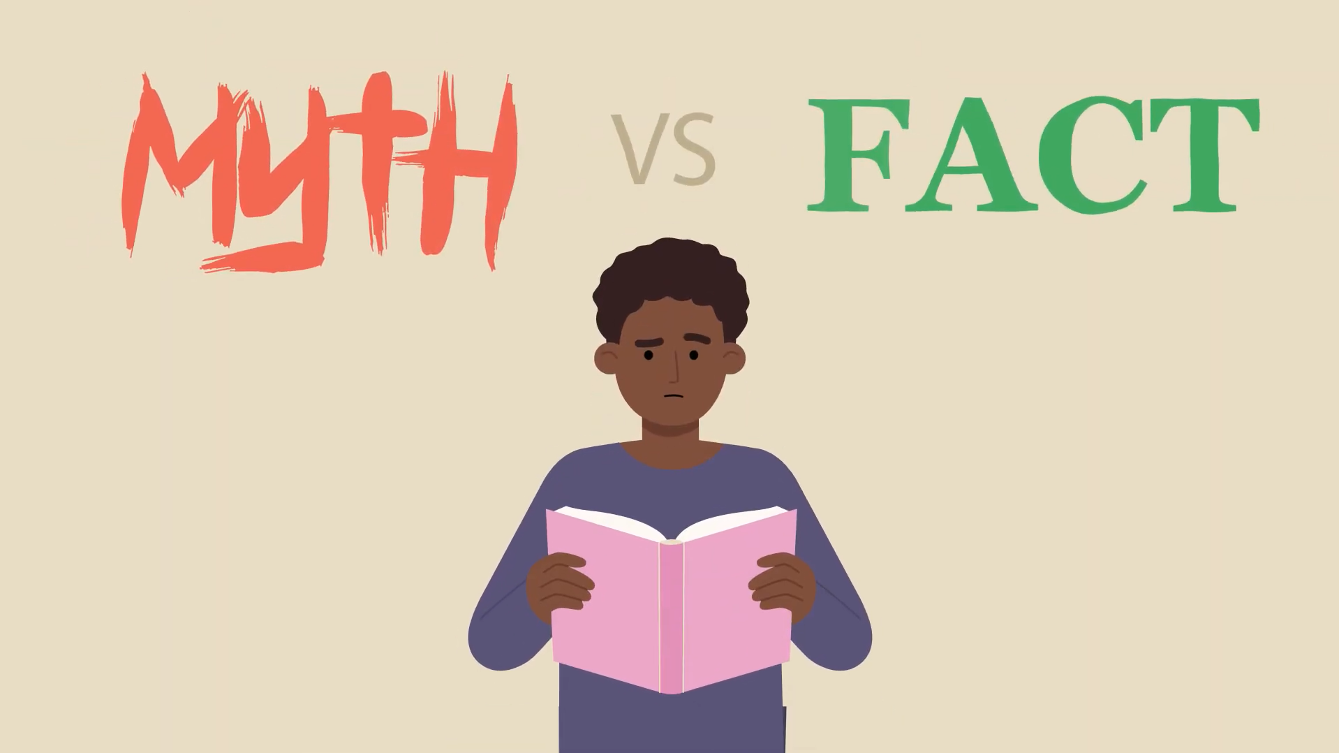
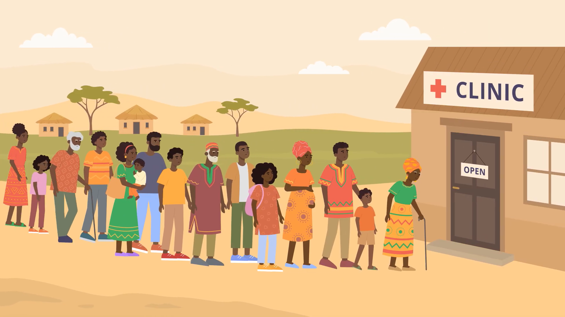
The animation uses clean, modern flat-vector style designed for clarity above all else. Characters are diverse across ages and ethnicities, with rounded shapes, soft features, and minimal detail. Scenes stay uncluttered with clear visual metaphors, icons and diagrams reinforcing the key information without overwhelming. Medical information made accessible, not clinical.
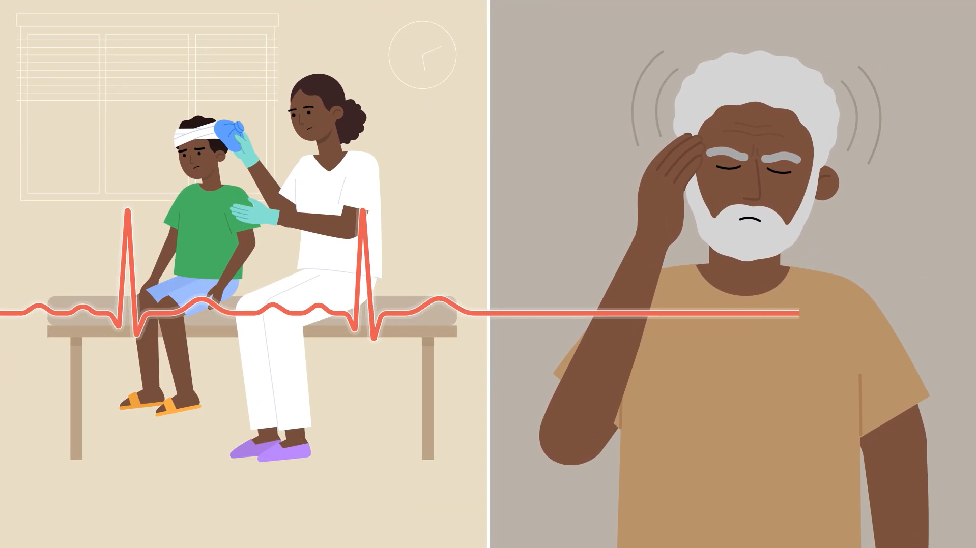
The colour palette is warm and optimistic: soft creams, sandy beiges, muted earth tones, pastel blues, with vibrant orange, green, purple, and coral accents. Clean whites and calming blues establish trust. Richer purples and darker overlays handle the neurological concepts, communicating seriousness without intimidation.
Narrated by long-term Leon! collaborator, Ghanaian-British voiceover artist Josef-Israel, the script stays direct. "You can help close this epilepsy treatment gap." No softening language, no unnecessary metaphors.
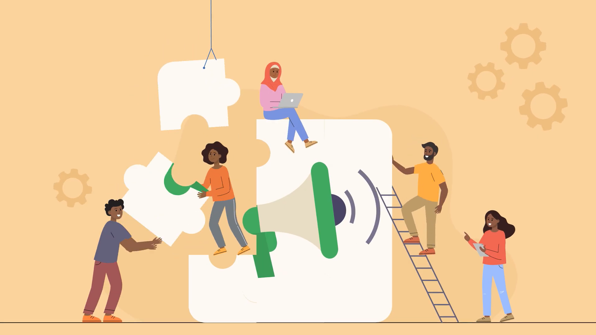
Just clarity aimed at the donors, policymakers, and global health organisations who can actually move resources.
What These Nonprofit Animations Teach Us
Medical animation works when emotion and biology aren't treated as separate things. TED-Ed's broken heart video proved grief is a measurable physiological event, not just a feeling. That honesty is what makes the recovery message actually land.
Educational animation doesn't have to choose between playful and serious. The Met proved you can open with "if you dare" and still teach people something genuinely important. Curiosity is a valid entry point for real knowledge.
Nonprofit animation for advocacy needs directness above all else. No hedging, no softening statistics to protect your audience's comfort. The epilepsy video shows that policymakers and donors respond to clarity. Here's the problem, here's the solution, here's why it matters. That's how nonprofit animation moves funding.
Catch up on our 2026 nonprofit animation roundups:January | February | March | April | May.
Or explore the archive: Best Nonprofit Videos of All Time.
What's Leon! Animation Studio Up To?

We just wrapped the BAND Foundation nonprofit animation you just read about. But our 2D animation studio isn't stopping there. Currently in production: healthcare animation for Oxleas NHS on women's health, medical animation for the British Heart Foundation on cardiovascular education, and videos for Médecins Sans Frontières and Simon Scholars.
Our charity animation studio makes nonprofit animation, medical animation, and educational explainers for organisations whose messages actually matter. If yours is one of them, let's talk.