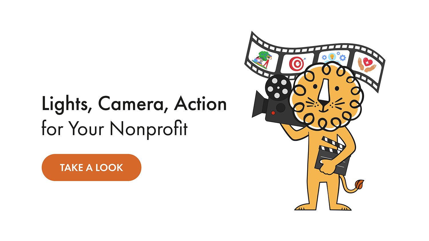
Best Nonprofit Animated Videos of 2026 (January)
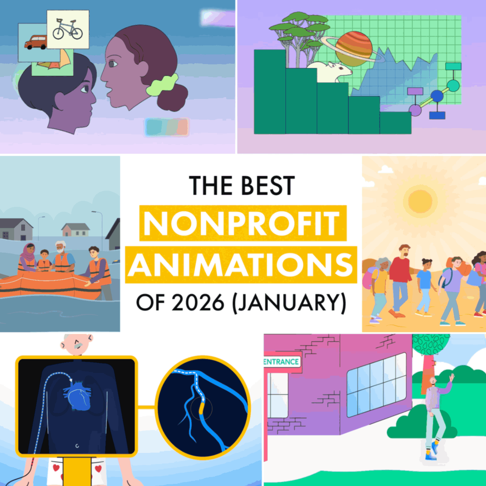
January 2026: new year, new you, new excuses. Twenty-twenty-fix is what we're calling it, because this is definitely the year things actually get better. Right?
These three nonprofit animations matched that energy. The Royal Society made statistics feel like common sense. The British Heart Foundation explained heart surgery without the anxiety. And IOM proved that humanitarian data infrastructure can actually be fascinating.
New year. Same complicated world. Three nonprofit animations that handled it well.
Best Educational Animation
The Royal Society's "The power of Bayesian reasoning"
Bayesian reasoning sounds intimidating. It's not.
Here's the entire concept: You think something is probably true. You learn new information. You update what you think. That's it.
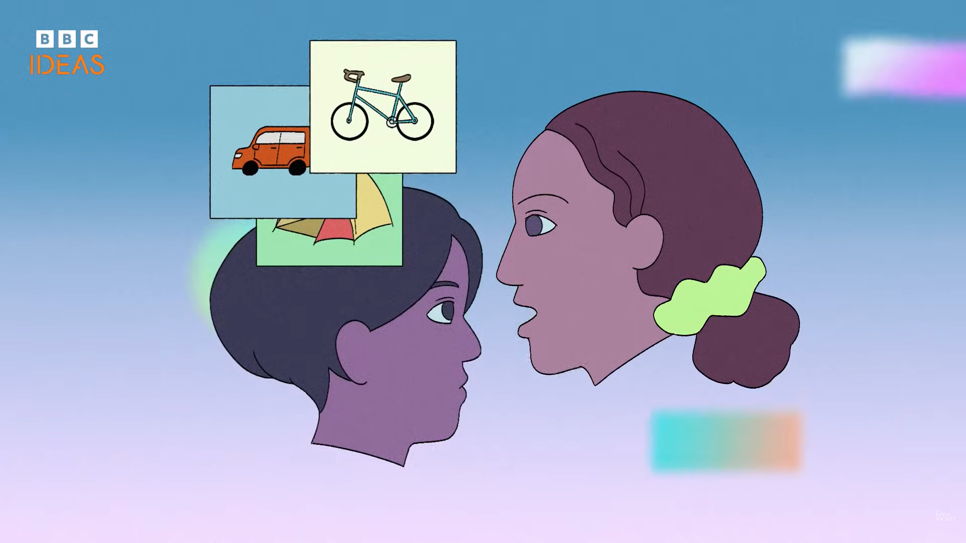
Example: You think there's a 50/50 chance of rain. You see dark clouds. Now you think 80%. Congratulations, you're a statistician.
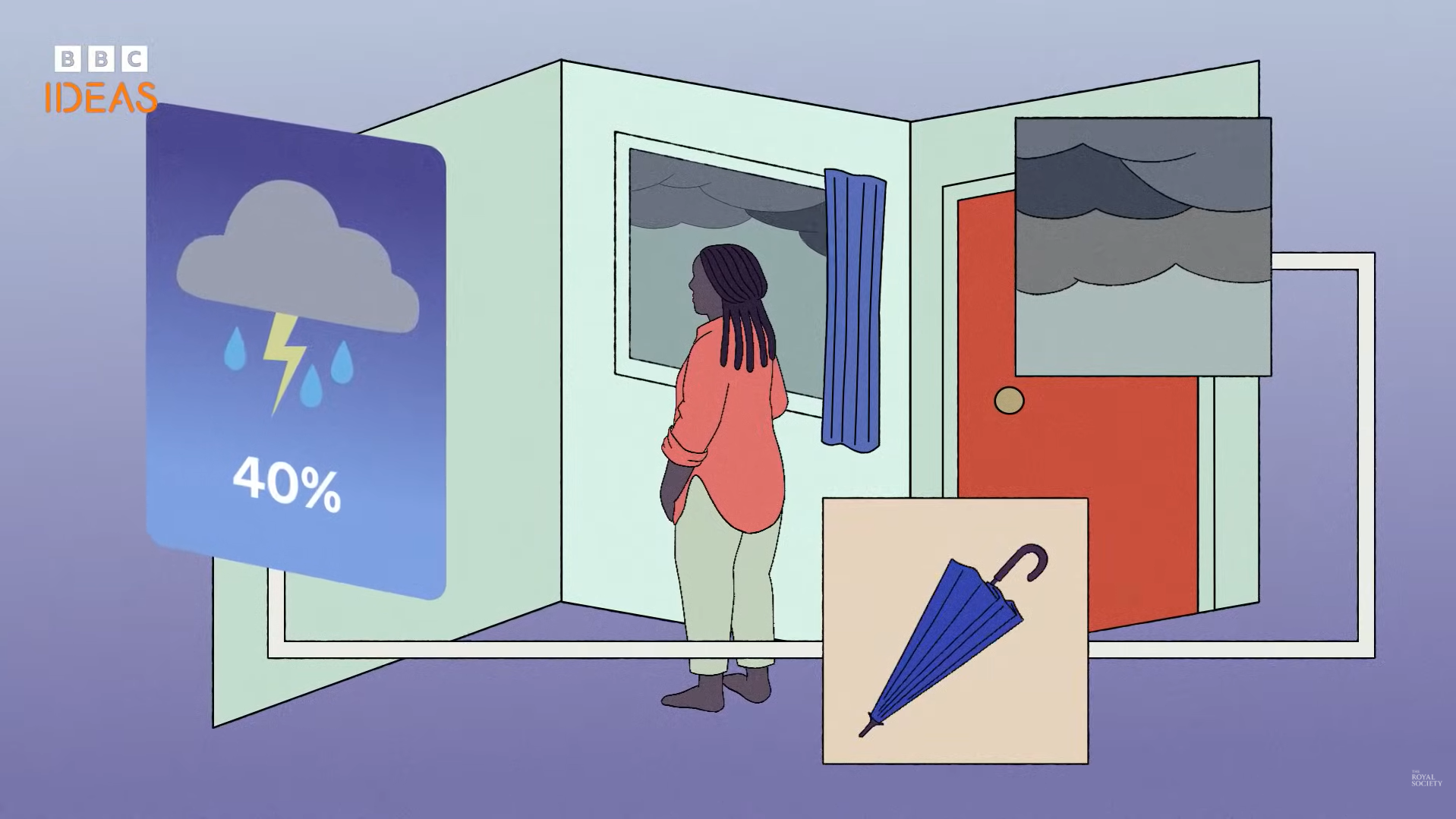
Rosanna Wan's animation for The Royal Society, in partnership with BBC Ideas, shows why this matters. Medical tests. Spam filters. Scientific research. All rely on updating beliefs when evidence changes.
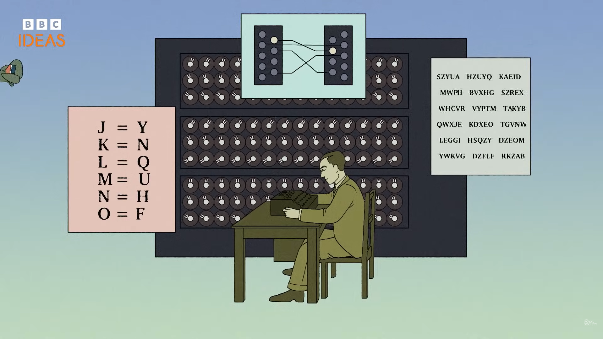
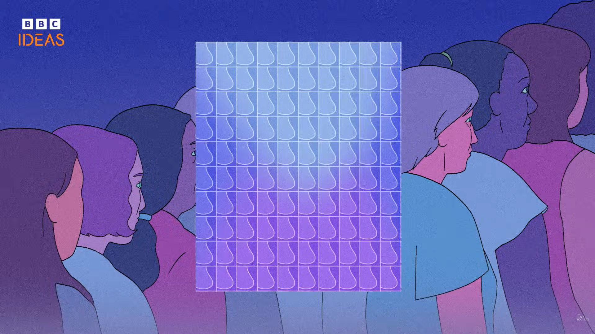
The animation style is contemporary editorial flat with clean vector illustration. Simplified shapes, minimal facial features, muted pastels and cool tones. Scenes arranged in layered panels, diagram-like and structured.
The video uses a breast cancer screening example. About 90% of cancers get detected by mammograms. But if you test positive, there's only about a 25% chance you actually have cancer. Why? Because the base rate is only 1%. Most positive results are false positives.
That's Bayesian reasoning doing real work. Updating probability based on what you already know, not just what the test says.
One commenter captured the lightbulb moment: "The 50-50 assumption is only valid if you assume that the coin is not rigged. What if you CANNOT make that assumption? That is where Bayesian statistics come in."
This educational animation makes a useful concept feel less like advanced maths and more like common sense.
Best Healthcare Animation
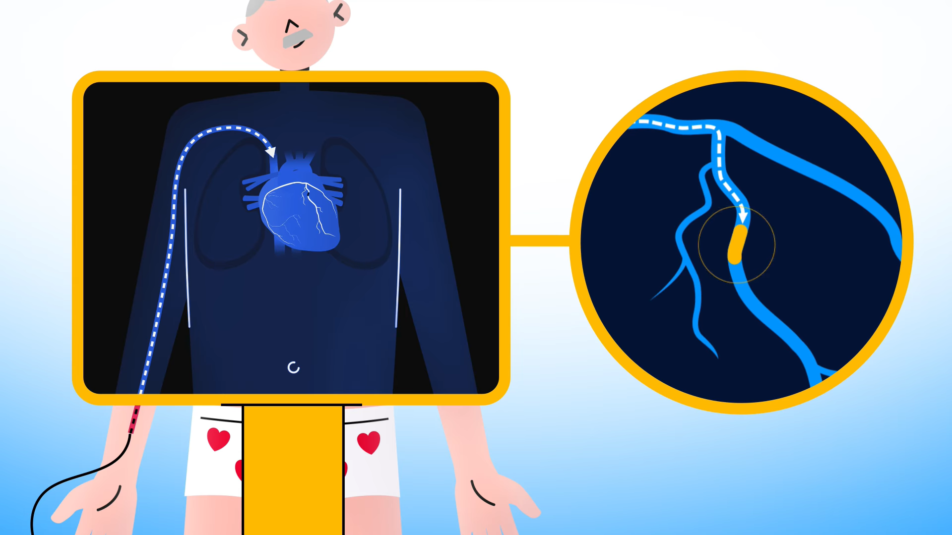
British Heart Foundation's "What is an angioplasty and stents?"
Your heart artery is blocked. A doctor needs to widen it. Here's exactly what happens.
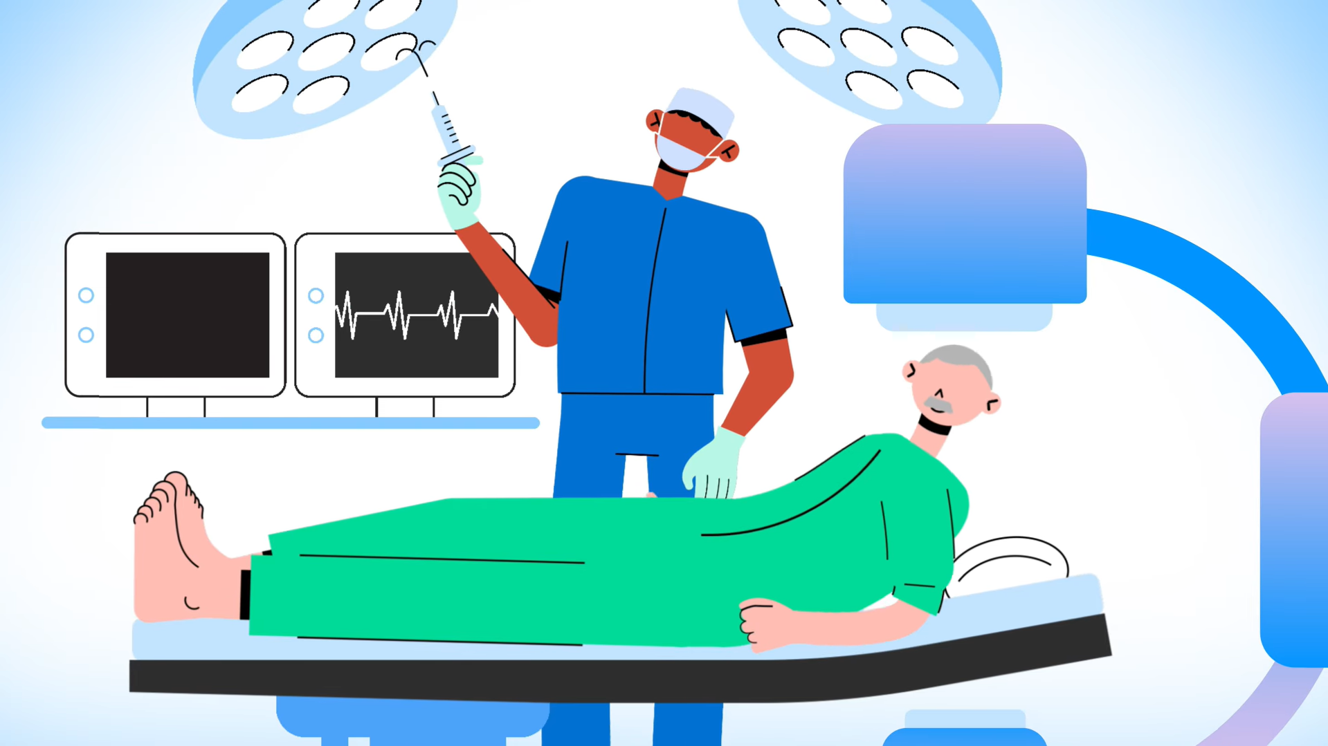
The British Heart Foundation's healthcare animation walks through angioplasty step by step. Preparation, imaging, balloon inflation, stent placement, recovery. Exactly what a nervous patient needs to hear before going under.
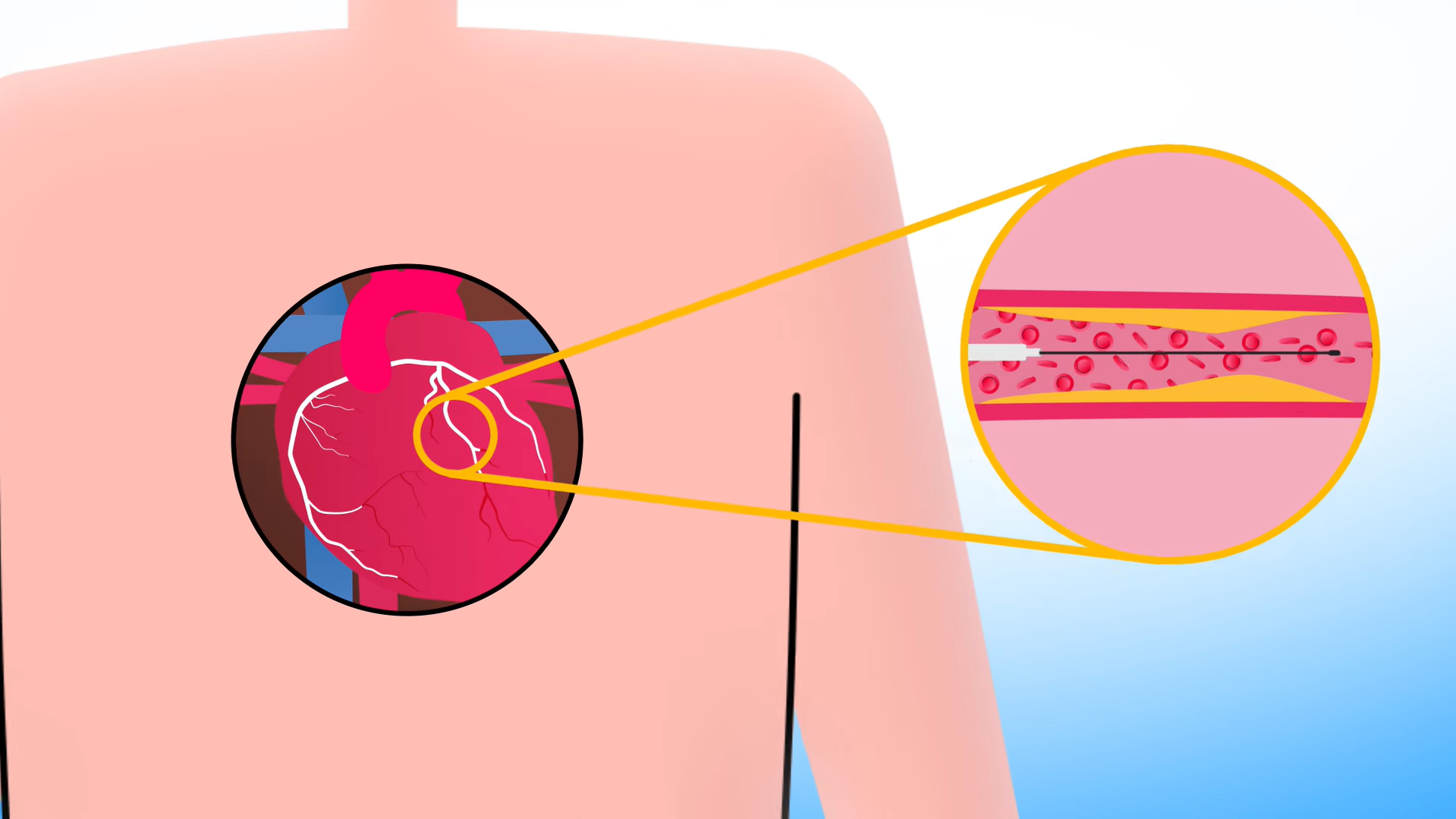
The animation style is modern flat healthcare explainer with smooth vector shapes and bold outlines. Characters are geometric with rounded heads, minimal features, block-like bodies. Brighter colours: blues, greens, yellows, pinks. Backgrounds light or white, reinforcing a hospital-like atmosphere.
(Worth noting: we've made loads of videos for BHF lately, but this one's all theirs. Their in-house team nailed it!)
The northern England voiceover stays calm: "You'll be awake, but you shouldn't feel any pain." The procedure lasts one to two hours. Most patients go home the same day or the next.
This video isn't trying to go viral. It's trying to help someone understand what's about to happen to their body.
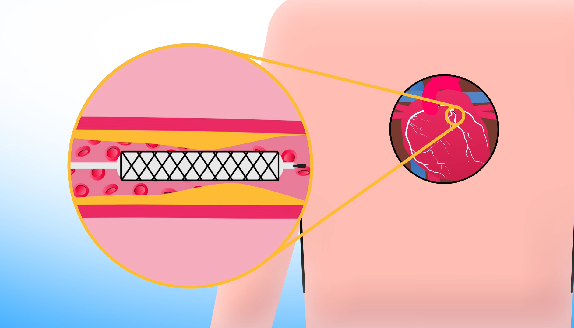
Healthcare animation doing exactly what it should: making the unfamiliar familiar before it becomes frightening.
Best NGO Animation
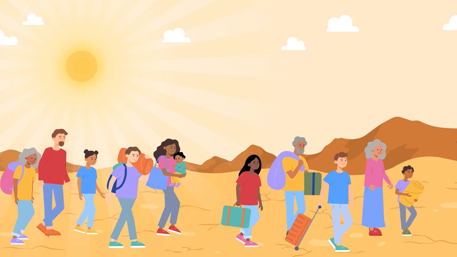
IOM's "DTM: When Data Becomes Impact"
Humanitarian response runs on data nobody sees.
Our animation studio created this video for IOM's Displacement Tracking Matrix to explain the infrastructure behind crisis response. Field teams collect displacement data. Surveys get processed. Information gets stored. Partners access platforms. Decisions get made.
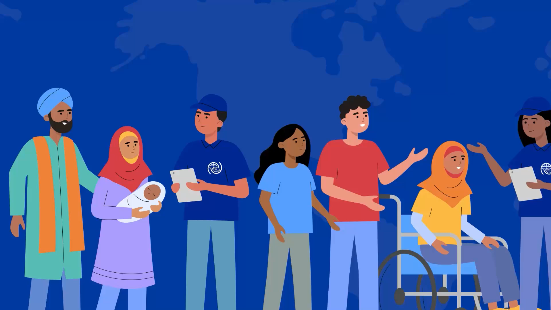
The video explains what most humanitarian communications skip: the technical backend. As the narration puts it: "That's the work you see, but what about the work you don't see?"
The animation style is human-centered flat narrative illustration. Clean vector artwork with expressive characters, rounded silhouettes, soft features. Strong institutional blues balanced with warm accent colours: orange, red, yellow, coral. Authority meeting empathy.
The narration, delivered by young Johannesburg-based voice artist Yamikani Katunga, cuts straight to it: "Having strong data foundations is at the heart of DTM's work." That's not just a tagline. It's backed by 1,700 expert-designed survey questions built into the system.
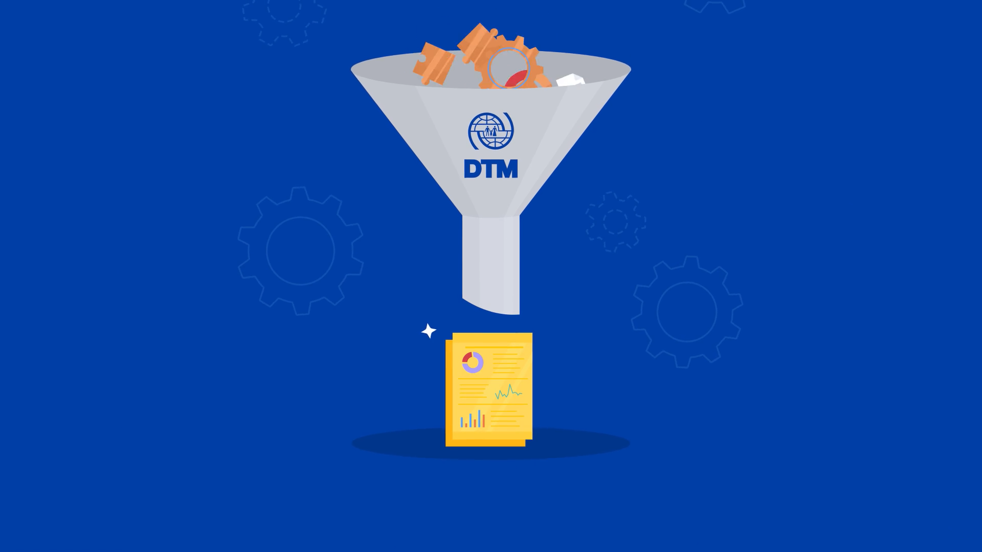
Showing the human side of displacement response is straightforward. Explaining the data infrastructure behind it is a different challenge entirely. That's what this video was built for.

This NGO animation is about the work nobody films. The systems working quietly behind every humanitarian response.
What These Nonprofit Animations Teach Us
Educational animation works when complexity becomes clarity. Bayesian reasoning. Breast cancer screening. Statistical thinking. The Royal Society made all of it feel like something you already knew.
Healthcare animation can make scary procedures feel manageable. The BHF's angioplasty video doesn't dramatise heart surgery, it demystifies it. Knowing what to expect is the best antidote to anxiety.
NGO animation can go behind the scenes. IOM's DTM video skipped the frontlines entirely. The systems, the data, the infrastructure—the work nobody films but everybody needs
Missed our 2025 roundups? Catch up on January, February, March, April, May, June, August, September, October, November, and December.
Also here’s our Best Nonprofit Videos of All Time blog.
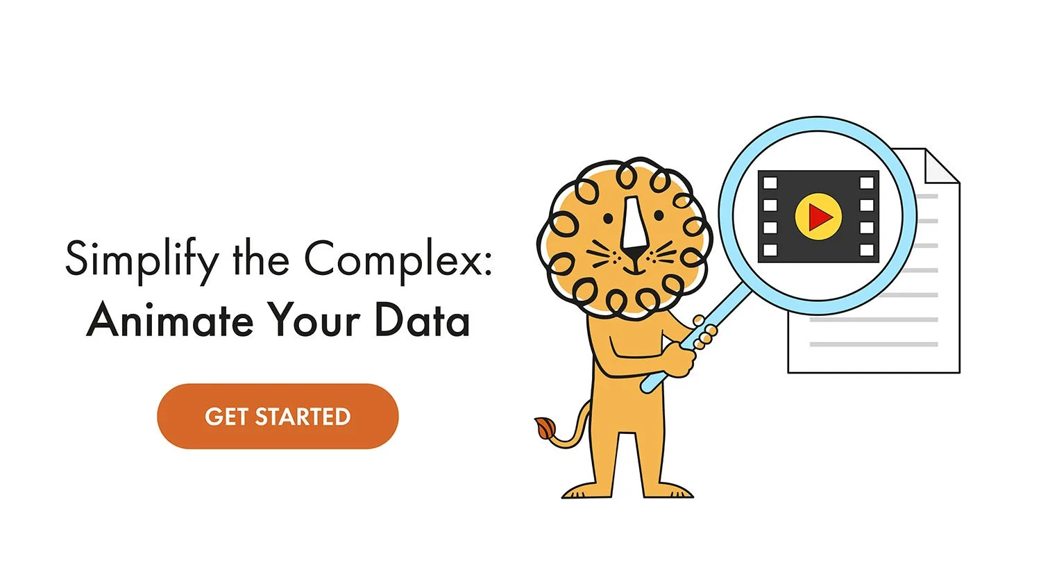
What's Leon! Animation Studio Up To?

Our charity animation studio has been busy. Recent work includes inflammatory arthritis for Dorothy House, MyChart for young people at Guy's and St. Thomas', women's and girls' health hub for Oxleas NHS, and the IOM DTM video featured above.
That's the work we've been doing. Now back to what you just read: Bayesian reasoning, heart surgery, and humanitarian databases. Not exactly light reading, yet here you are. If we made those readable, your story is in good hands.
Our 2D animation studio makes nonprofit videos that don't waste your time.