Best Nonprofit Animated Videos of 2025 (September)

September weather can't make up its mind—blazing sun one day, torrential rain the next. This September's nonprofit animations were just as unpredictable: bacteria as thriller villains, rainforest resistance without words, and war statistics as painted art.
As a charity animation studio, we spend a lot of time studying the competition. These three made us wish we'd made them ourselves.
Best Healthcare Animation
TED-Ed's "Is it really that bad to eat cookie dough??"
Cookie dough looks delicious, right?
Denys Spolitak's TED-Ed healthcare animation is about to ruin that craving by making Salmonella the most memorable villain you've watched all month.

Most healthcare explainer videos about food poisoning follow the same tired script: scary bacteria → wash your hands → done.
Spolitak flips the script entirely.
Salmonella itself becomes the protagonist of a survival thriller. This healthcare animated video opens like a true crime documentary: "Somewhere on a farm in Iowa in 2010, a hen lays an egg…" Then it tracks a single bacterium's journey with genuine narrative tension.

The animation style is hand-drawn digital illustration with soft textures and muted earth tones. Storybook warmth for a story about mass hospitalisation. The genius move? Humanising the pathogen. When the narrator explains how Salmonella "senses threats, adapts, and invades," you're suddenly rooting for the world's least sympathetic character.

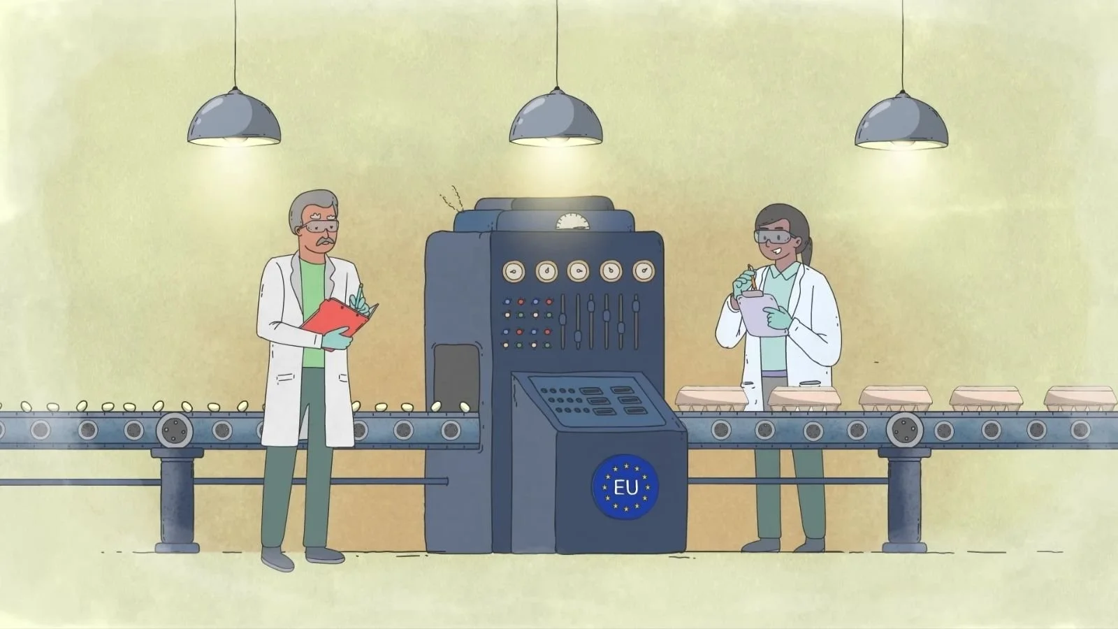
The 2010 Iowa outbreak wasn't bad luck—it was systemic failure. One farm's negligence triggered a crisis that infected millions across the United States. This healthcare explainer video uses that disaster as a case study, connecting farm corruption to global health consequences.

At 340,000+ views, it proves honest healthcare animation beats sanitised messaging every time. The YouTube comments say it all. One viewer confessed: "I work at a pizza restaurant and I cannot express how hard it is to suppress the urge to just take a ball of dough and take a chomp out of it."
Another mourned: "Cookie dough should be off limits' Absolutely soul-crushing."
If you're still craving cookie dough after watching this, at least you'll know exactly what you're up against. Spoiler: it has a needle-and-syringe system.
Best NGO Animation
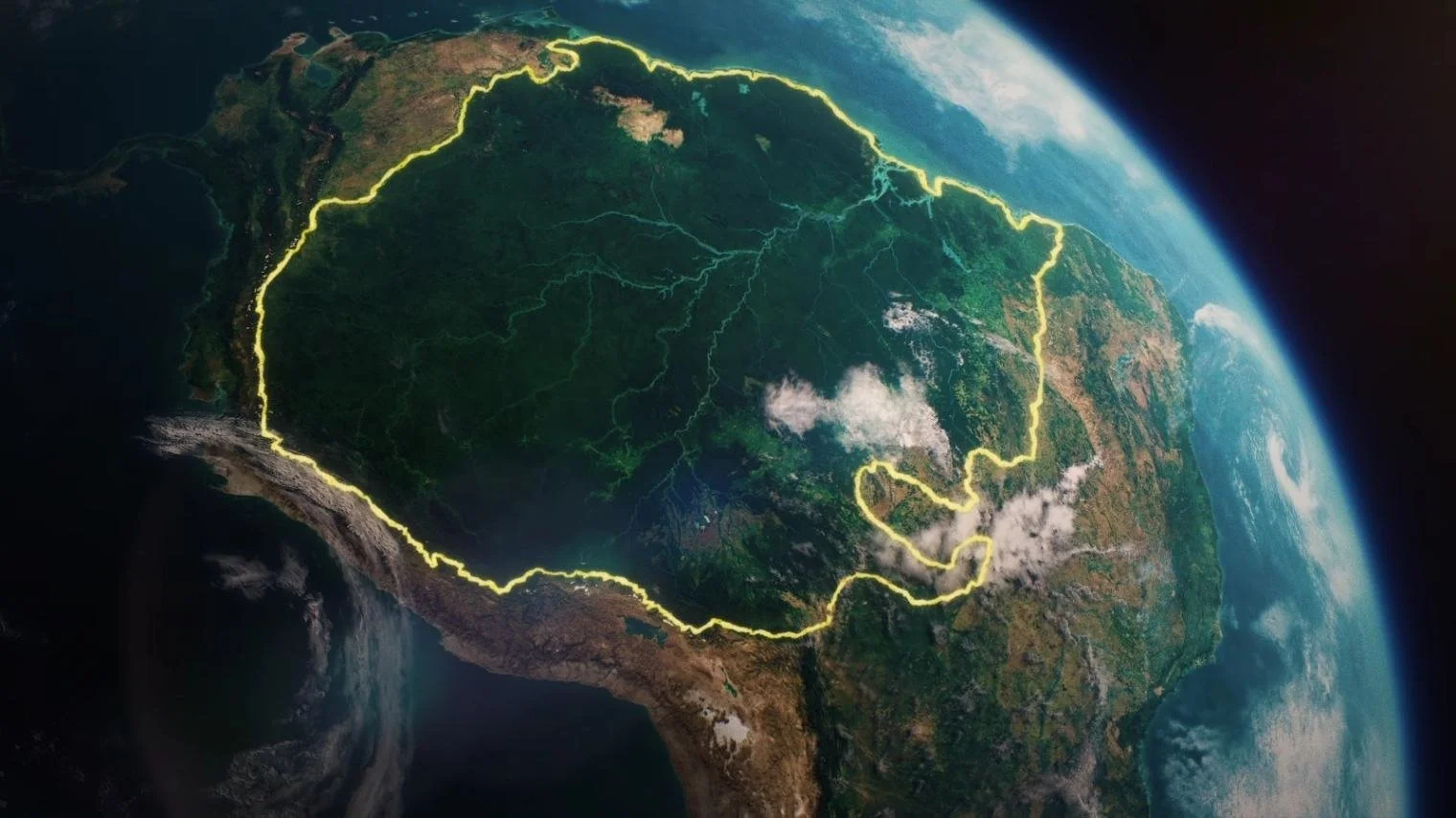
Greenpeace's "Respect the Amazon"
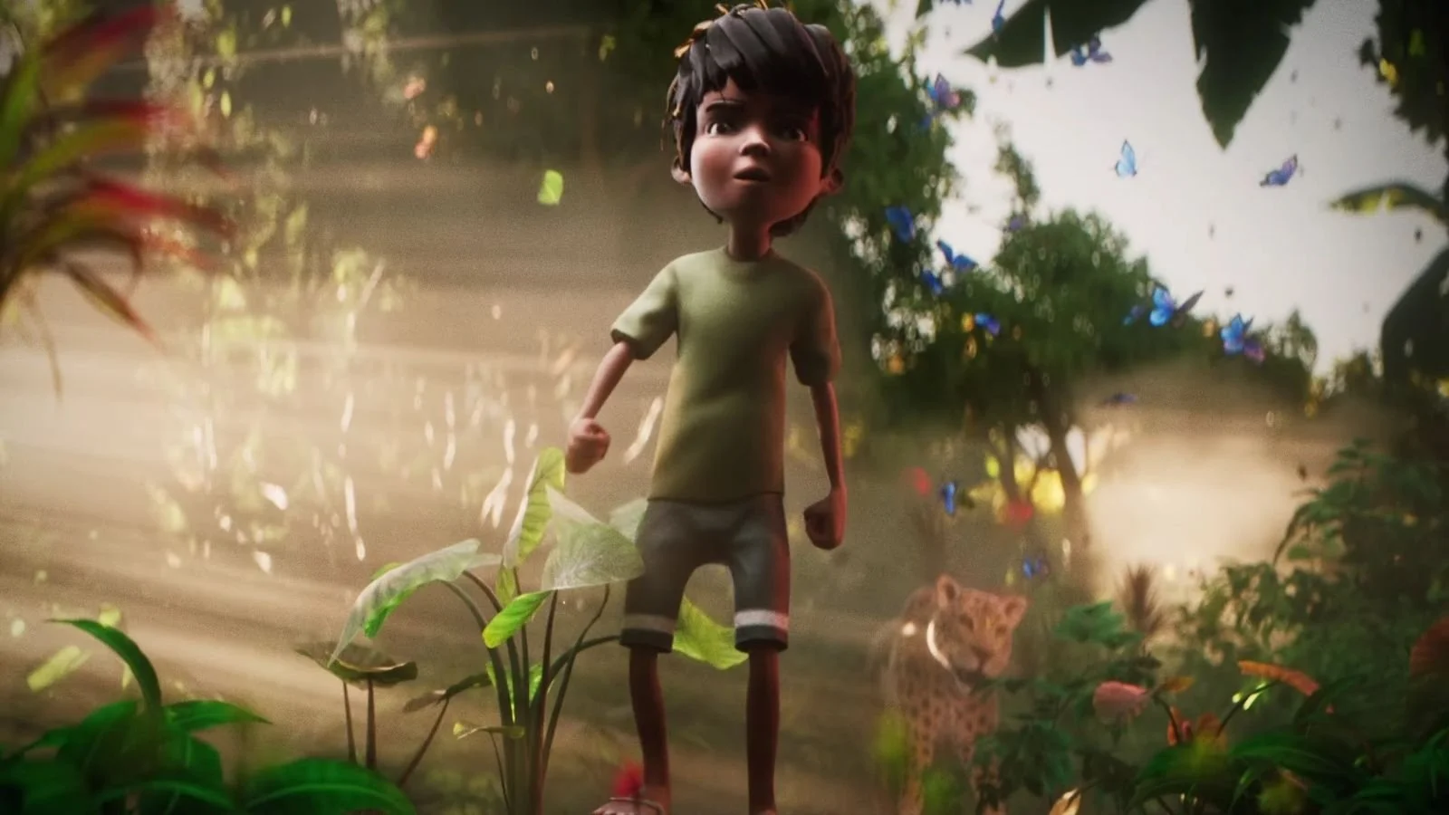
Greenpeace dropped this NGO explainer video for Amazon Day (September 5), and Studio Birthplace delivered something that looks more like a Pixar trailer than a typical nonprofit animation. And they did it without a single word of narration.
The animation blends near-photoreal rainforest rendering (volumetric lighting, drifting mist, layered depth) with stylised, caricatured human characters. That contrast keeps the story universal rather than documentary-stiff. You feel like you're standing in the Amazon while watching a myth unfold. No voiceover needed. Drum and bass layered with environmental sound effects drives the emotional rhythm as the visuals unfold.
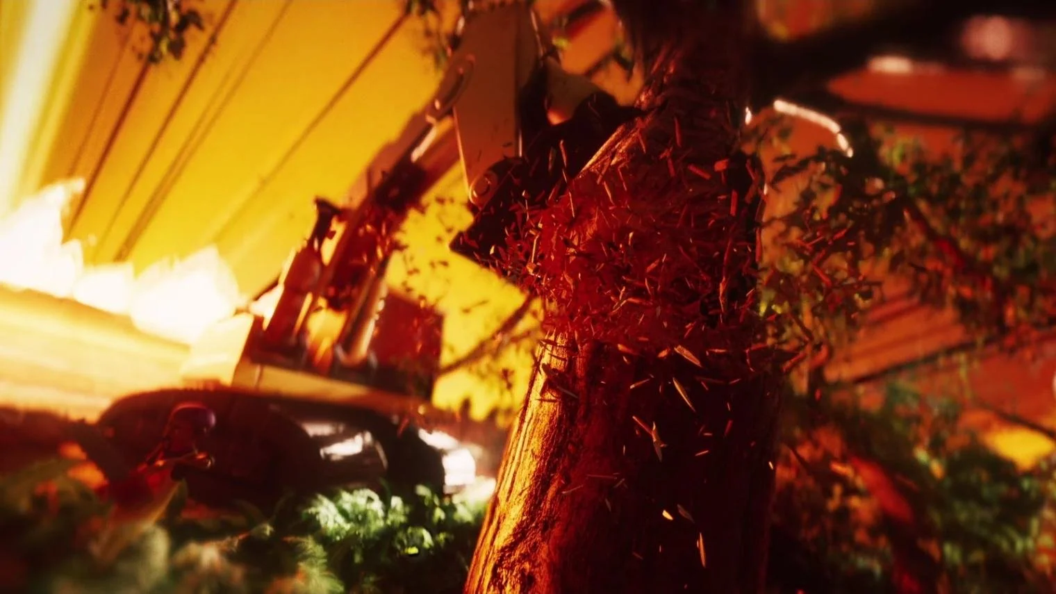
Studio Birthplace uses particle simulations for swirling leaves, dust, and fire, with energy bursts and glowing light rays that dramatise moments of transformation. When a young defender's surge of power halts the "mechanical army of bulldozers," the VFX doesn't just dazzle—it functions as visual metaphor, turning ecological resistance into something epic and emotionally stirring.

The hero narrative is simple: local defenders, including Indigenous communities and children, rise against agribusiness greed. The Batista brothers (executives linked to meat conglomerate JBS) appear as grotesquely rich villains surrounded by money and flames. It's dark irony, not comedy. The emotional tone stays deadly serious.
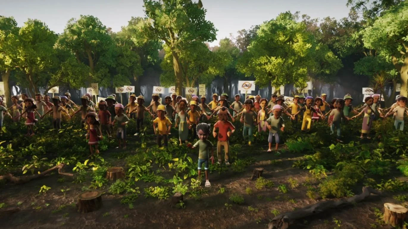
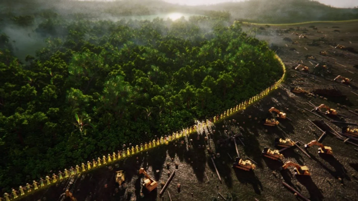
The closing shot is brilliant: defenders line up in glowing yellow, and as the camera pulls back, you realise they've formed the outline of the Amazon rainforest itself. It's a visual metaphor for solidarity that hits harder than any statistics-filled charity explainer could.
At 135,000+ views across YouTube, Facebook, and Instagram, the comments show it landed:
"We all together will raise our voice for our environment, for our planet."
"Such an impactful video - keep up the great work Greenpeace and together we will unite to protect forests!!!"
No script. No explanation. Just a forest worth defending.
Best Educational Animation
ICRC's "Armed conflicts in the world today: The data"
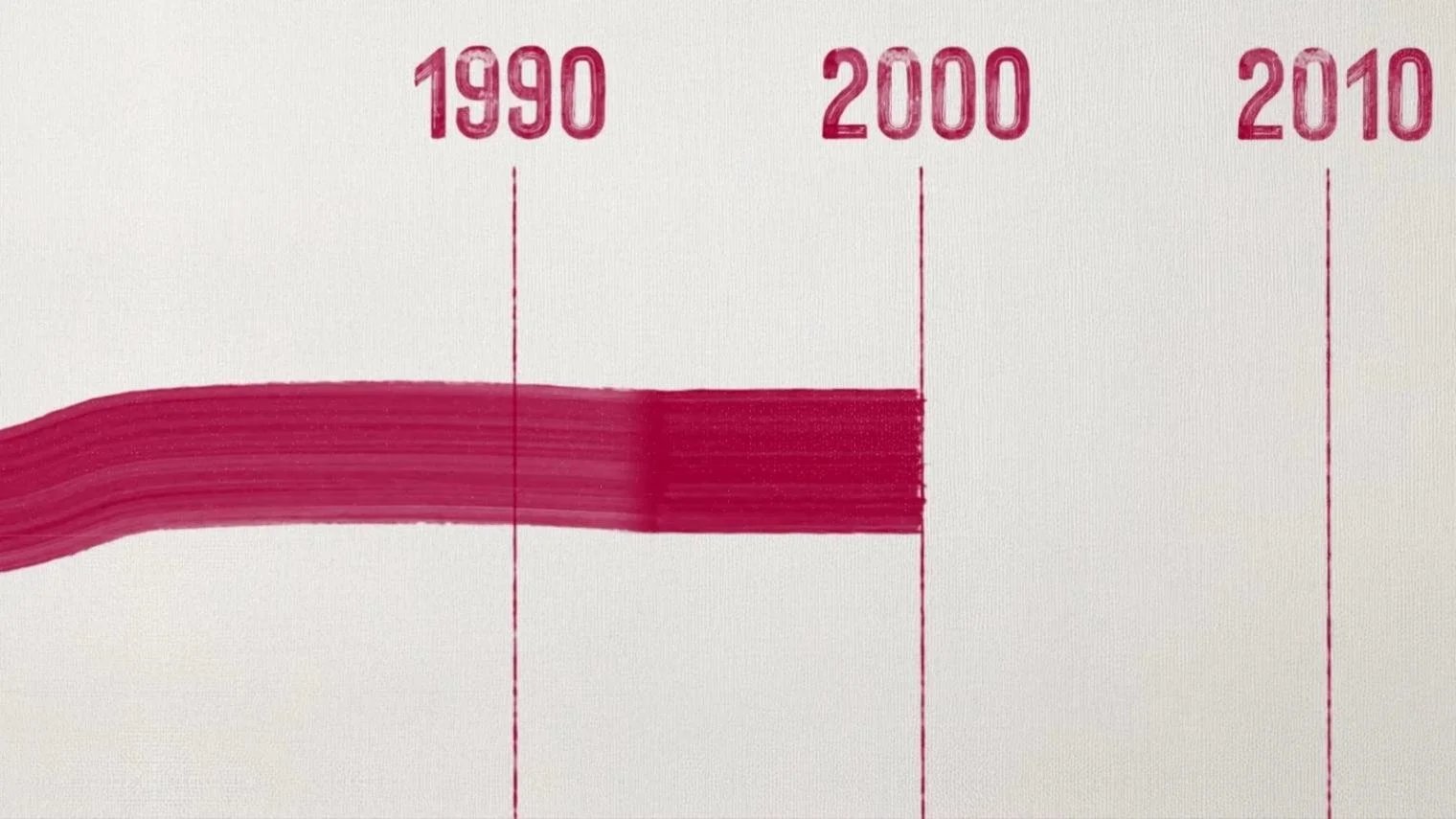
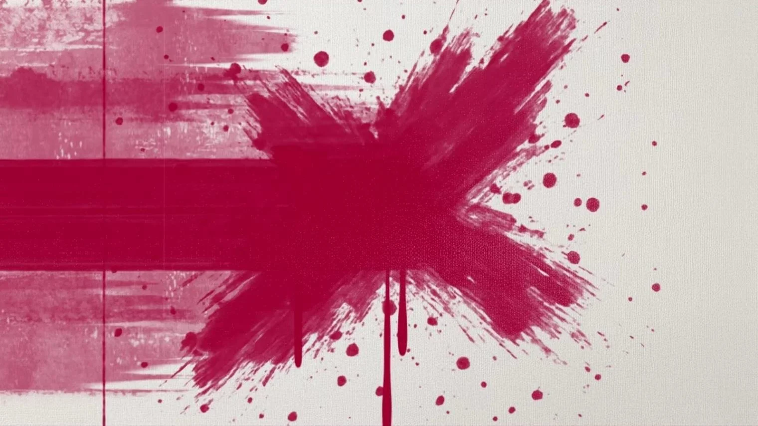
The International Committee of the Red Cross created something quietly devastating: a 60-second explainer animation that turns war statistics into painterly art.
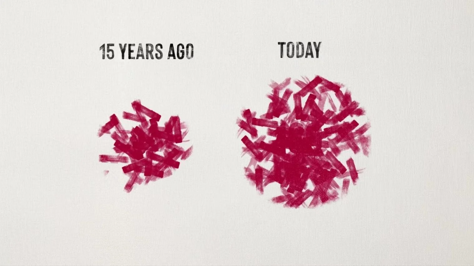
The animation uses a paint-textured, minimalist visual style where every element appears hand-painted on canvas. Red and black brushstrokes dominate, symbolising violence and blood, while the white background creates stark contrast. Motion is smooth yet deliberate. Paint marks and ink splatters organically form numbers, timelines, and data visualisations that feel alive.

Organic brush strokes and bleeding watercolour effects give the imagery raw emotional weight, transforming statistics into expressive art. Growing clusters of red and black visually communicate escalation and chaos. It's a painterly infographic that combines simplicity, symbolism, and texture to convey war's gravity without a single photograph of destruction.

The ICRC's message goes beyond typical humanitarian appeals. The video explains something often overlooked: why legally classifying conflicts is important in the first place. Once a situation is classified as armed conflict, international humanitarian law applies—and warring parties are legally obliged to limit suffering.
One YouTube comment cuts straight to it: "International Humanitarian Law, is foremost."
This explainer animation deserves far wider reach than its current numbers suggest. The ICRC trusted paintbrush strokes and sober facts to do the work, and proved that sometimes the quietest charity videos hit hardest.
What These Nonprofit Animations Teach Us

September's three charity videos demolished the typical awareness campaign playbook. Here's what they left behind:
Match your style to your story. Spolitak made bacteria feel like a thriller villain with storybook warmth. Studio Birthplace turned environmental resistance into myth with cinema-quality visuals. The ICRC made war statistics hurt using nothing but paint. Each nonprofit explainer video chose form that amplified function.
Stop underestimating people. These healthcare and NGO animations tackled genuinely complicated subjects—microbiology, deforestation economics, international law—and explained them clearly without condescension. Audiences noticed. 342,000 views and passionate comments prove it.
Make videos that deserve attention. Most charity explainer videos disappear because they're forgettable by design. These three educated, provoked, and stuck in people's heads—which is what the best nonprofit videos do.
Missed our earlier 2025 roundups? We've been doing this since January—catch up on January, February, March, April, May, June, and August (minus July, because even animation studios need a break sometimes!).
What's Leon! Animation Studio Up To?
Right now? Our 2D animation studio just wrapped a video for Oxleas NHS Trust, encouraging patients to consent to data sharing. It plays silently in waiting rooms (with a voiceover option for presentations), so the visuals had to do all the work. Explaining data privacy without sound? That's the kind of challenge we live for.
If you just read this entire blog about Salmonella, war statistics, and rainforest resistance without getting bored, your message deserves the same treatment.
Most charity videos fail because they're terrified of being interesting. As charity and healthcare animation specialists, we take complicated messages and make them impossible to ignore. If that sounds better than another forgettable video, let's talk!