Best Nonprofit Animated Videos of 2025 (June)
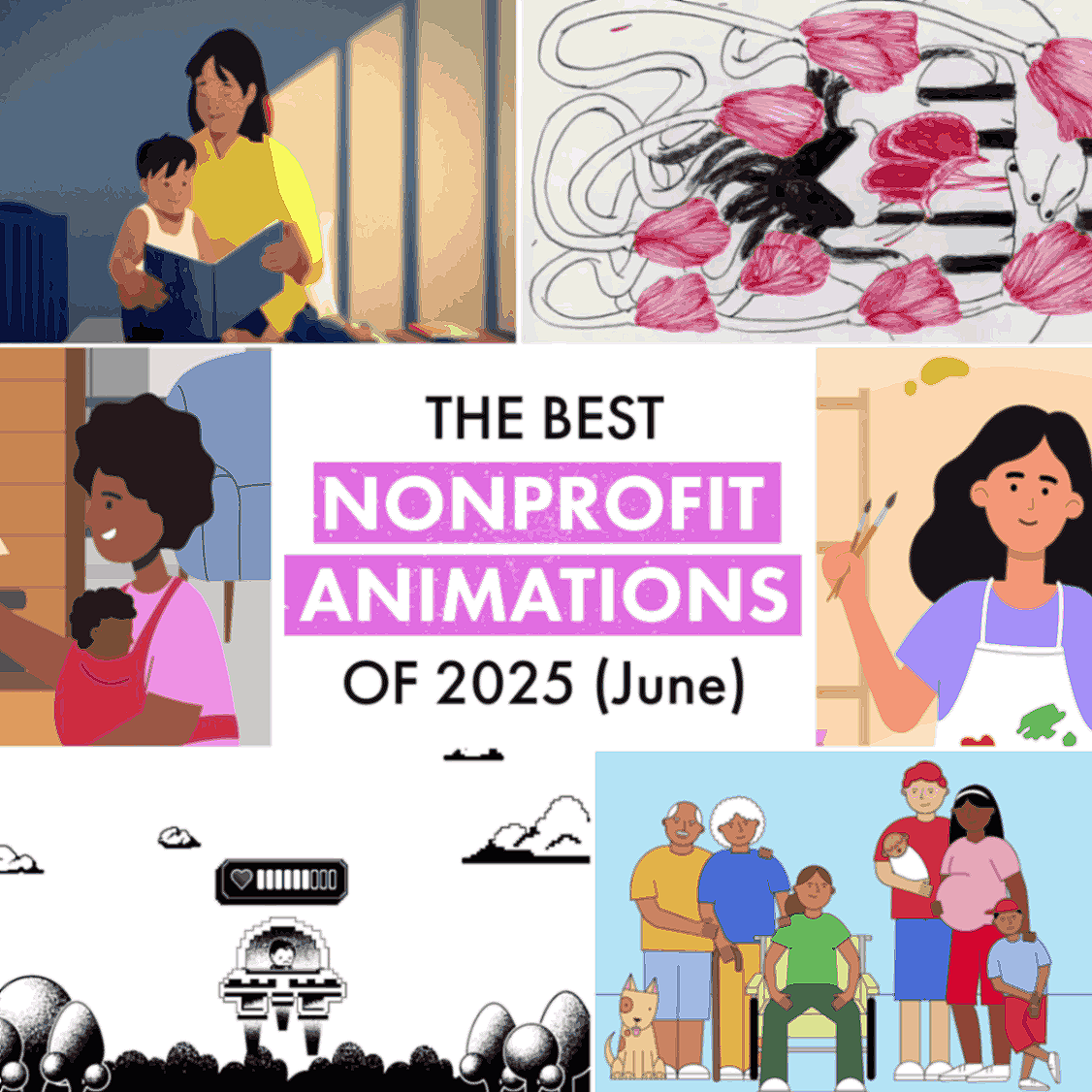
What are the best nonprofit animated videos of June 2025? Based on our hunt through the internet's charitable corners, these nine videos stood out for actually solving communication problems rather than just looking pretty.
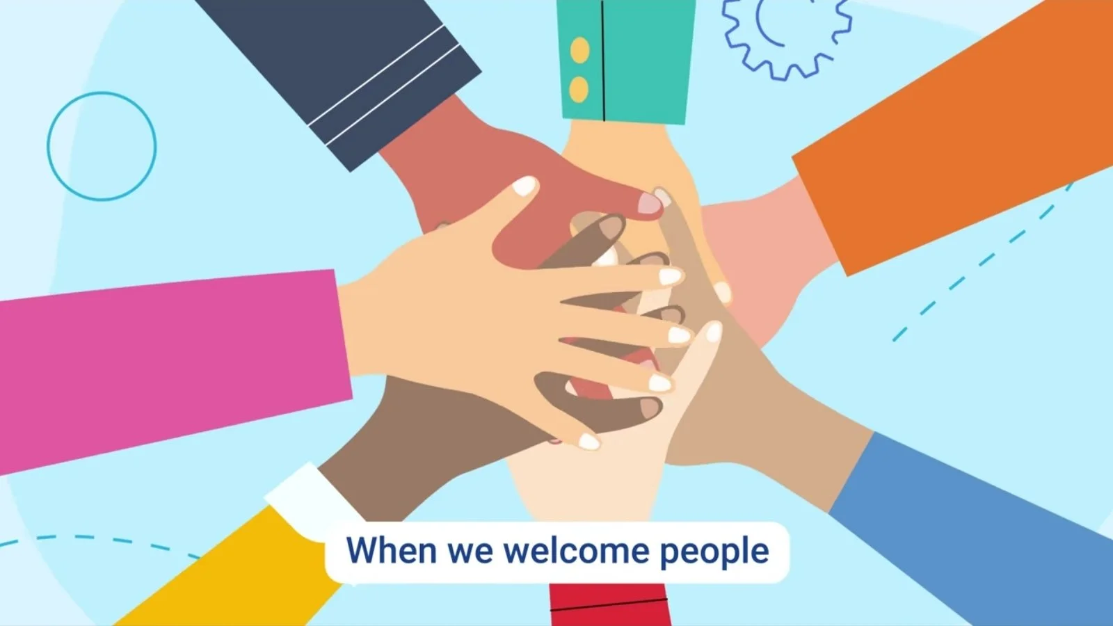
June brought us nonprofit videos that didn't just collect digital dust—they tackled real challenges. From museum therapy guides to gaming-led mental health initiatives, these animations demonstrate that great design transforms big ideas into messages that people actually understand.
As a charity animation studio, we've curated nine standout pieces (including a couple of our own) that demonstrate how animated explainer videos can tackle everything from formula marketing ethics to climate action. Each nonprofit video offers lessons in matching visual strategy to charitable goals.
Best Charity Animation
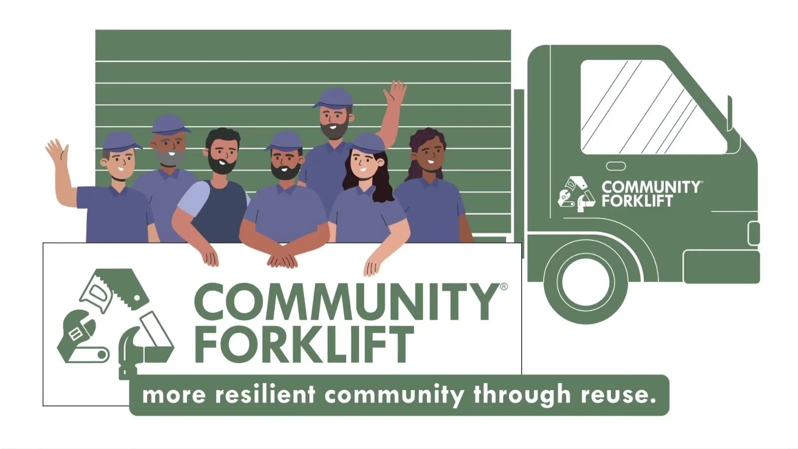
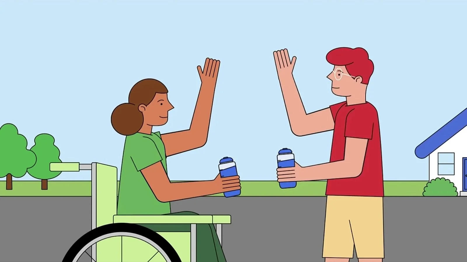
Community Forklift’s “Choose to Reuse!”
We at Leon! Animation Studio actually produced this animation for Community Forklift, so we're quietly chuffed to see it working so well. But we promise our analysis is completely unbiased. Well, mostly…
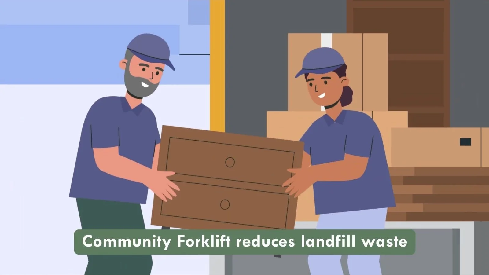
Community Forklift is the DC-area nonprofit reuse centre that collects donated building materials and home essentials, selling them at low cost and giving many away to neighbours in need. Think of it as a huge warehouse of perfectly good items saved from the landfill.

Their charity video "Choose to reuse!" demonstrates how to reframe environmental issues through community empowerment rather than the usual crisis messaging that makes everyone feel guilty and switch off.

The 40-second animation turns a reuse warehouse into a lively neighborhood story. Crisp flat-vector characters and bold colors flow through smooth transitions, making construction waste diversion feel inviting rather than a tedious eco-task.
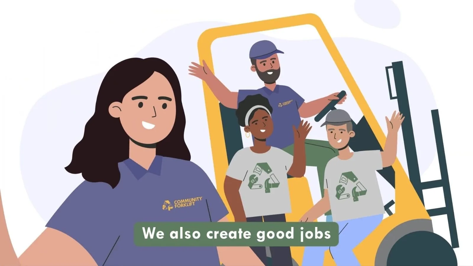
Rather than guilt-based green talk, Community Forklift highlights abundance, turning reuse into opportunity and care. John Raynar’s upbeat voiceover seals it: “We create good jobs and provide free supplies to neighbours in need,” radiating genuine local pride.
Best Educational Animation
MoMA’s “How Does Your Body React to Art?”
The Museum of Modern Art revolutionised institutional videos with "How does your body react to art?"—a 2-minute piece that transforms museum anxiety into somatic healing. This isn't your typical educational waffle; it's guided therapy disguised as art appreciation.

Animator Gaia Alari uses a fluid hand-drawn style where nothing feels static—every figure is intentional and constantly evolving. Arms multiply into delicate lines, hair unfurls like ink before morphing into petals, and flowers twist into new forms as scenes seamlessly shapeshift.
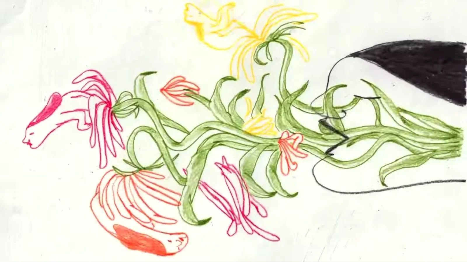
Each transition feels smooth and organic, delivering moments of quiet surprise that are as intriguing as they are calming. This visual choreography turns emotional overwhelm into something deeply relatable, without ever leaning on clinical language.
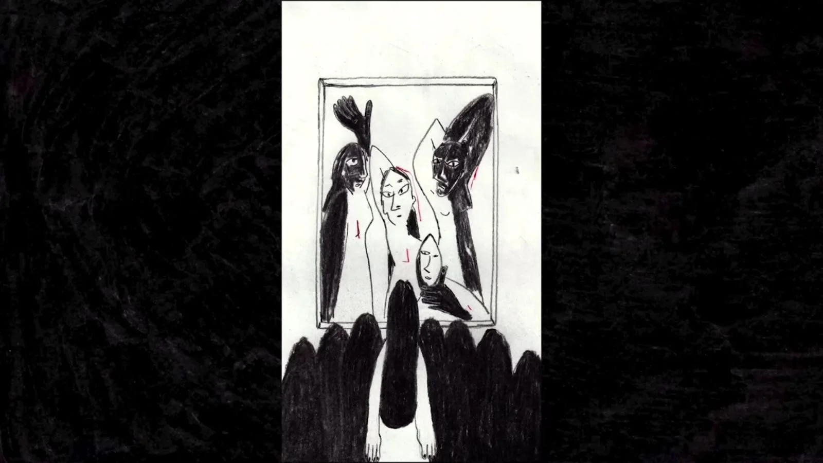
Therapist Emily Price guides viewers through what feels like a gentle, imaginative meditation. Her words paint pictures—energy flowing down like roots, or light streaming through the crown of your head.

The most memorable cue? “Imagine a big soap bubble around you, a force field protecting you.” It’s a grounding exercise disguised as creativity, giving anyone a simple way to feel safe and steady in overwhelming spaces.

Best Healthcare Animation
Movember’s “Level Up Your Mental Health - Spot the Signs”
Movember's healthcare video cracks the code on reaching men who typically avoid mental health discussions. Using 3-minute 8-bit gaming aesthetics, they transform emotional check-ins into recognisable gaming concepts—genius.
The black-and-white pixel art with heavy dithering creates instant gaming nostalgia whilst addressing serious mental health symptoms.
Terms like "rage quitting," "doom scrolling," and "overly aggro" reframe depression and anxiety in authentic gamer language that actually resonates rather than clinical jargon.
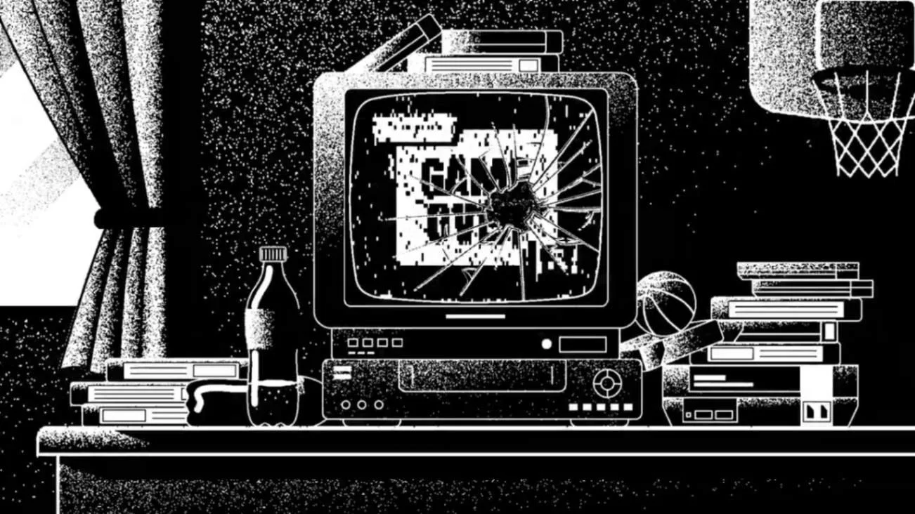
The "Rage Combo" sequence is particularly clever—it takes the familiar concept of arcade-style power-ups and uses it to show how online anger can escalate.
The video reframes mental health cues through the lens of gaming. Instead of outlining symptoms clinically, it uses familiar concepts—like low health bars or sudden disconnects—to illustrate mood changes, withdrawal, and other signs of distress.
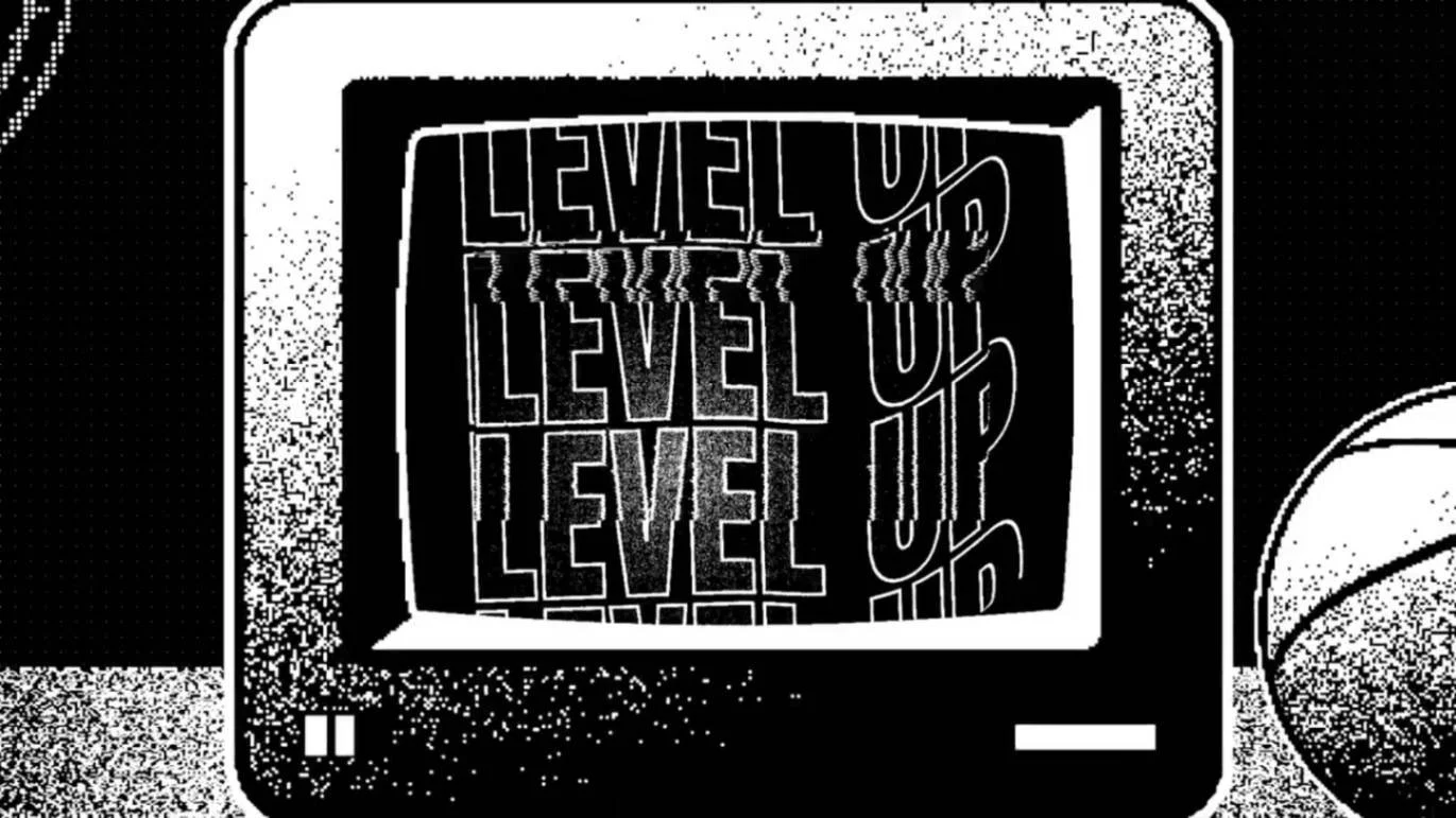
This approach makes it easier for gamers to recognise when a teammate might need support. It's a perfect example of speaking your audience's language rather than forcing them to learn yours.
Best NGO Animations
We found two standout NGO videos this month that tackle completely different challenges, but both nail their brief.
American Red Cross’s “How to Stay Safe in Extreme Heat?”
The American Red Cross delivers lifesaving public health messaging with "How to stay safe in extreme heat"—a 60-second animation that could prevent heat-related deaths during increasingly dangerous heat waves.
Using clean flat vector illustration with high-contrast black outlines, giving every scene a sharp, easy-to-read look. Bright, contrasting colours highlight key safety tips, while minimal background clutter keeps the focus on essential actions.

They've created a PSA that balances visual appeal with critical safety information. The animation's strength lies in its directness: "Extreme heat can be deadly. Stay hydrated, cool, and connected."

No statistics, no fear tactics, no complicated explanations—just clear, actionable guidance delivered with emergency response authority. For crisis communication, visual clarity and message simplicity beat creative flourishes every time.
World Meteorological Organization’s “COPE Disaster Champions Jingle”
The World Meteorological Organization created what's essentially an earworm for climate action with their "COPE Disaster Champions" jingle, performed by a chorus of talented children.

The video pairs a hand-drawn sketch style with a playful sing-along jingle—“Little changes every day, keep disasters at bay.”

The tune leans cheesy but sticks in your head, while the animation impresses with fluid transitions and lively illustrations.

Sometimes the goal isn’t polished sophistication, it’s creating something catchy enough to stick, the kind of Last Song Syndrome that spreads through repetition and shareability.

Best Policy Animations
We've been spoilt for choice this month in the policy animation section, so we decided to include three videos. Let's start with one of our own...
UN Network Migration’s “Change the Narrative, Not Migration”
We at Leon! Animation Studio actually produced this one for the UN Network on Migration, so we're having a good month for shameless self-promotion.

The UN Network on Migration nonprofit explainer animation has a simple but powerful message that appears on screen at the end in typewriter style: change how we talk about migration, not migration itself.
Rather than drowning people in statistics about global displacement, the video uses symbolic imagery and poetic language to challenge how we think about migrants.

Its visual execution blends soft gradients, flowing transitions, and hand-drawn textures, giving each scene a warm, human feel that matches the narrative’s empathy.
It's essentially asking: what if we saw migration as people bringing stories and skills rather than as a problem to be solved?
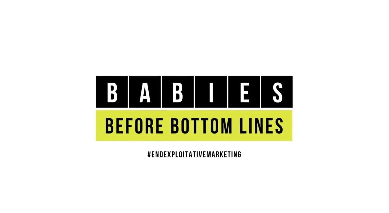
WHO’s “Babies Before Bottom Lines”
The World Health Organization delivers their most confrontational video with "Babies before bottom lines"—a 70-second animation that exposes formula industry manipulation of vulnerable new parents.

It combines bold kinetic typography with intimate black-and-white live-action, using sharp text animations and repeated phrases to mirror the script’s urgency.

The script cuts straight to the emotional core: "Your heart splits in two. One half now lives on the outside" acknowledges how vulnerable new parents feel before exposing how companies exploit that vulnerability.
Sometimes, emotional honesty hits harder than endless statistics.
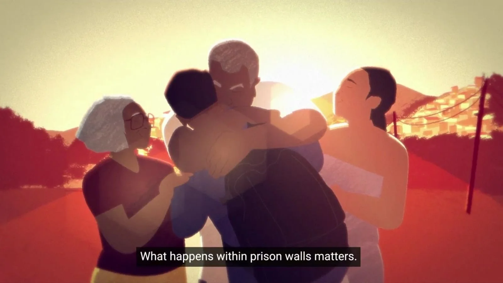
UNODC’s “Prison Reform: Why Does it Matter” and “The Bangkok Rules on Women Prisoners”
The United Nations Office on Drugs and Crime created two complementary animations addressing global prison reform using painterly 2D animation that humanises systemic failures.


Both "Prison reform: why does it matter" and "The Bangkok Rules on women prisoners" use symbolic lighting—dark blues for institutions, warm colours for community reintegration.
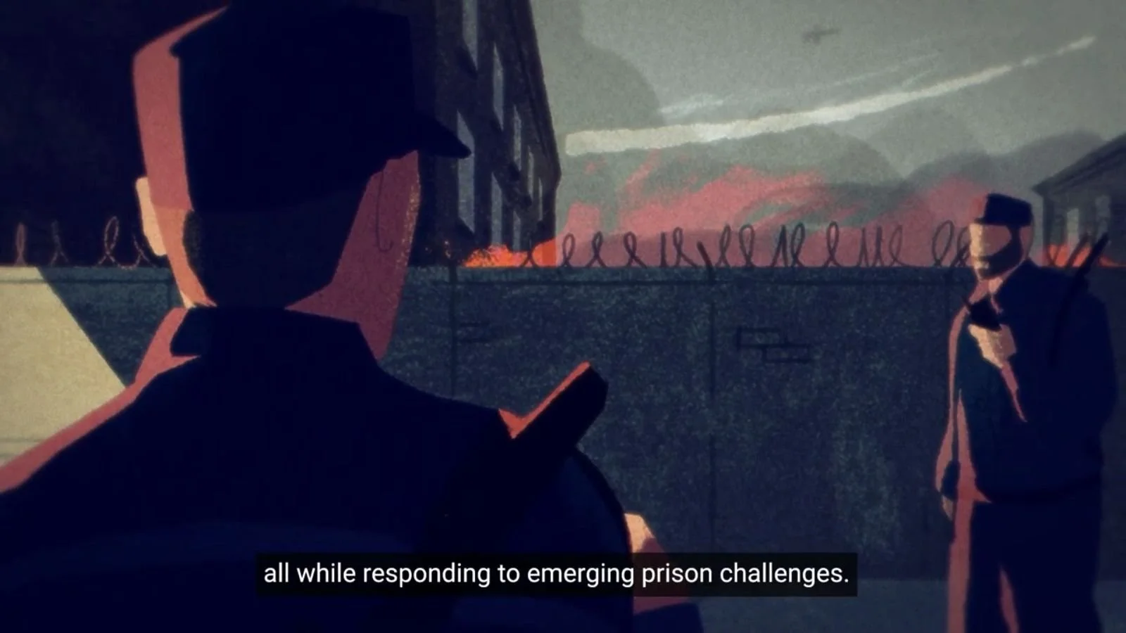

The animation combines soft, textured brushstrokes with fluid, symbolic transitions, creating an emotional rhythm that reflects the journey from isolation to hope.


"What happens inside prisons affects us all" reframes prison reform as community self-interest rather than abstract human rights advocacy, which is much more likely to get people's attention.

Bonus: Classic Animation Meets Celebrity
United Nations’ “Join the Smurfs and Speak Up for a Better World!”
The United Nations' collaboration with the Smurfs franchise demonstrates how beloved animated characters can carry serious advocacy messages without losing their authenticity.

"Join the Smurfs and speak up for a better world!" features celebrity voices from Rihanna, Hannah Waddingham, Billie Lourd, and Amy Sedaris delivering climate action messaging.
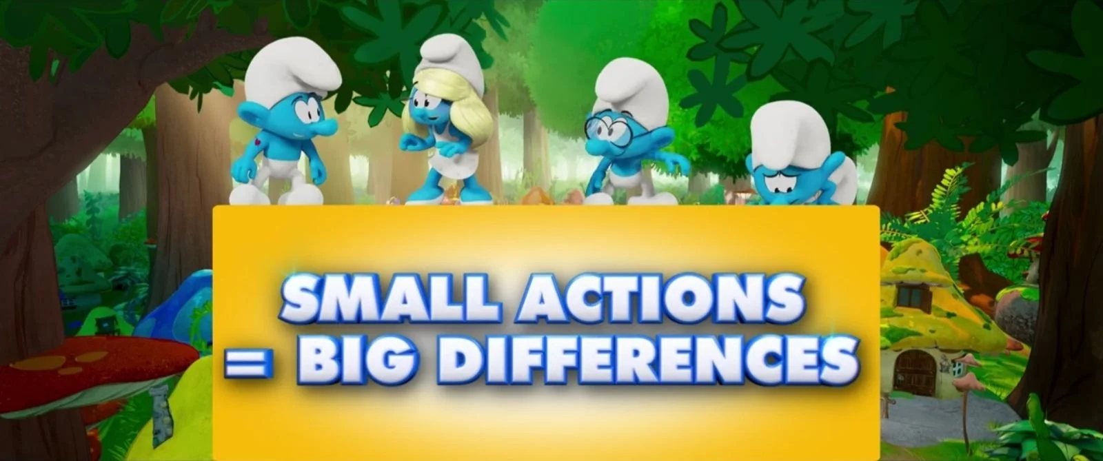
The 3D-rendered Smurfs deliver lines like "Small actions can make a big difference".
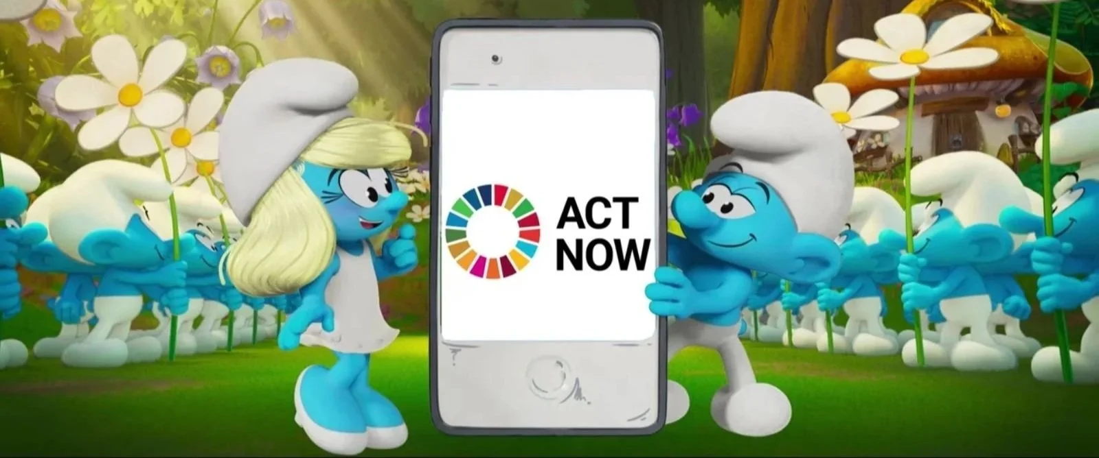
Have a watch and decide for yourself whether celebrity cartoon climate messaging is your cup of tea.
What Made These Nonprofit Animations Work?

These June 2025 animated videos share critical success factors that nonprofits can actually replicate:
Speaking the audience's language: Movember uses gaming references, MoMA offers calming guided therapy, and WMO delivers a sing-along jingle, each tailored to its audience instead of relying on generic nonprofit language.
Concrete outcomes over vague awareness: Community Forklift's job creation, Red Cross's safety protocols, and WHO's policy critique all provide specific results rather than abstract "raising awareness" goals that don't actually mean anything.
Visual style matching emotional strategy: From WHO's deliberately unsettling corporate exposé to MoMA's healing-focused art therapy, each non-profit animations' visual approach reinforces what it's trying to achieve emotionally.
Key trends we're spotting: Educational animations that promote healing, not just information; content tailored to cultural contexts through visual style; policy explainers used for institutional critique; and environmental messaging that emphasises abundance over guilt.
These aren't just pretty charity animations—they're comms tools that actually get results for the organisations that made them.
For more of our monthly best nonprofit animated videos of 2025 analysis, check out January, February, March, April, and May roundups.
Ready to Create Nonprofit Animations That Work?
These June 2025 nonprofit animated videos prove that exceptional charity videos come from understanding your audience's cultural context, emotional needs, and practical constraints. Whether you're targeting gaming communities, museum visitors, or policymakers, success depends on matching your visual strategy to your intended outcome.
At our 2D animation studio, we've spent years figuring out what makes charity campaigns actually work (spoiler: it's not just making them look pretty). We've also learned what definitely doesn't work—usually through mistakes that taught us valuable lessons about what not to do.
Ready to discuss how a charity explainer video could reinvigorate your mission? For budget-conscious organisations (let's face it, that's most charities), explore our guide to creating powerful nonprofit animations on a budget.
Drop us a line and let's chat about creating nonprofit animated videos that do more than just tick the "we made an animation" box on your annual report.