Best Nonprofit Animated Videos of 2025 (August)
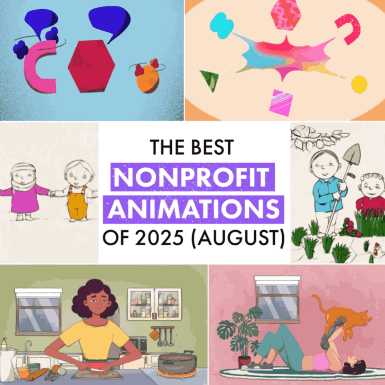
August served up three nonprofit animations that actually deserve your precious screen time (yes, we’re streamlining—just three videos this month because you probably don't have time for endless analyses anyway).
We found a behavioural science animation that could save you from your next disastrous team meeting, a medical explainer that might literally save someone's finger, and a UN food security animation that proves hand-drawn sketches can outperform million-pound corporate productions.
As charity and healthcare animation specialists who've witnessed enough well-intentioned but soul-crushingly dull awareness campaigns to fill several small countries, we can vouch that these three actually work. Each nonprofit animation manages to educate without anaesthetising its audience—no small feat in the charity video world.
Best Educational Animation
The Royal Society's "Smarter Decisions"
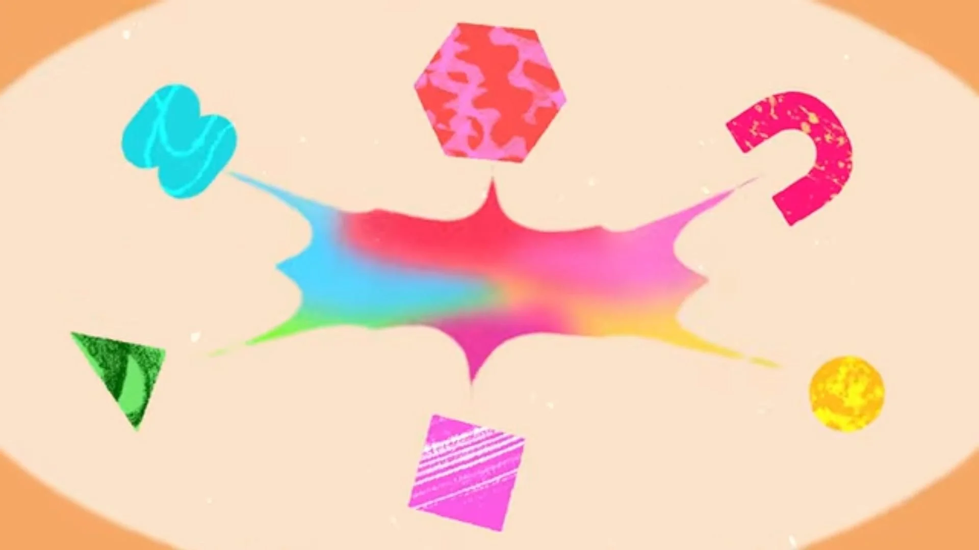
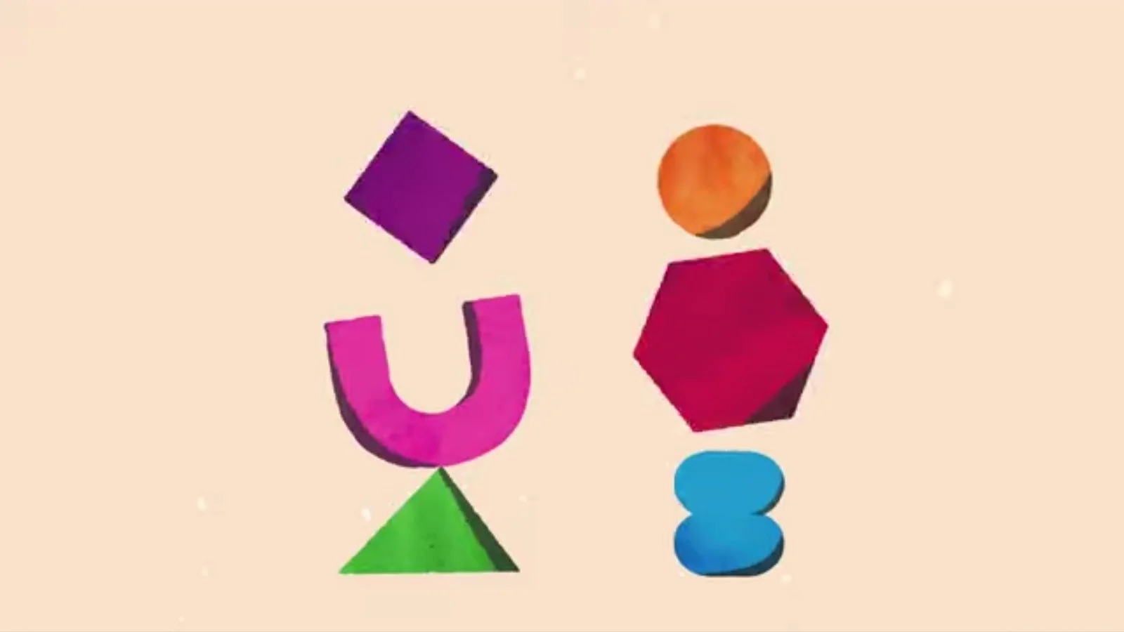
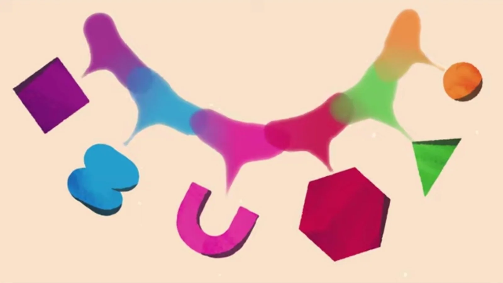
The Royal Society delivers behavioural science gold with "Smarter Decisions"—a 2-minute educational animation masterpiece that transforms academic research about group psychology into genuinely useful workplace advice.
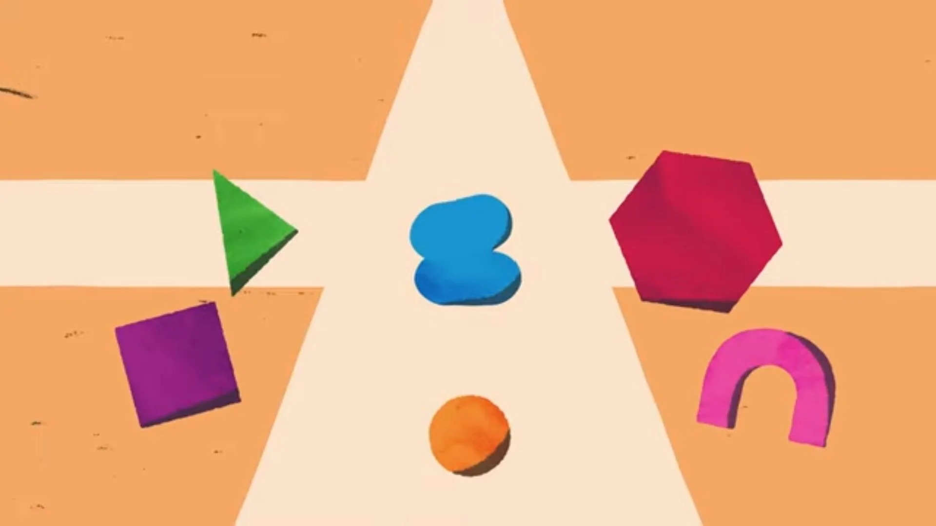
The genius move here? Using abstract shapes to minimally represent individual differences in thinking. Each distinct geometric form—cube, triangle, hexagon—represents unique perspectives without boringly complex illustrations. This explainer animation production shows how groupthink literally erases individuality as distinct shapes morph into conformity.
The script delivers the killer line—"Confidence can be mistaken for competence"—which is essentially the Royal Society's polite way of saying your loudest colleague probably knows the least.
It's workplace psychology distilled into strategies you can deploy the moment your next meeting starts going sideways.
Best Healthcare Animation
TED-Ed's "What Should You Do If You Accidentally Cut Off Your Finger?" by Denys Spolitak
Made you wince a little, didn't it? TED-Ed's healthcare explainer video does something brave: it destroys the Hollywood myth that severed limbs can always be magically reattached. Animator Denys Spolitak delivers honest, potentially life-saving medical information wrapped in clean visual storytelling.

This healthcare animation uses hand-drawn-style digital illustration with soft textures, warm tones, and expressive characters. Every scene is rich with subtle detail.

Spolitak's approach balances visual clarity with skilled character animation—when you need to remember a 6-12 hour window in a medical emergency, clean visuals matter more than flashy effects.
The 700,000+ views prove that honest healthcare animation resonates far more than dramatic fiction. Sometimes the best healthcare animation is the one that tells uncomfortable truths clearly rather than wrapping medical reality in false hope.
That said, the YouTube crowd inevitably fixated on over one detail. The top comment (with over 4,600 likes) jokes:
“Funny that she arrives to the hospital by taxi and not an ambulance. How to say you are from the US lol.”
Best NGO Animation
FAO United Nations' "Hand in Hand for Better Foods and a Better Future"
The Food and Agriculture Organisation created something genuinely different with "Hand in Hand for Better Foods"—a 60-second UN animation turns serious messaging into a delightful poetic experience.
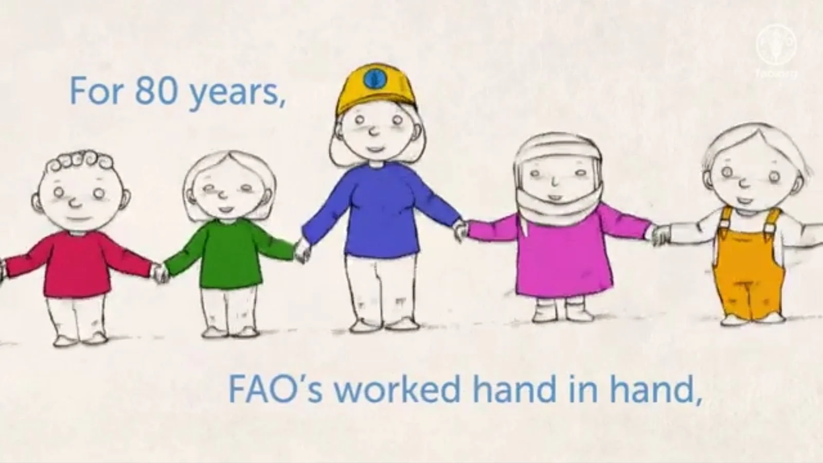
This NGO animation employs a distinctly hand-drawn illustration style that mimics traditional children's book artwork. Black ink strokes vary in weight and intensity, showing visible texture and irregularities that give drawings organic, human-made quality rather than digital precision.

For a UN agency championing human collaboration and food security, this human-centered visual approach is perfectly calibrated.

The four-part call to action (choose diverse food, share with community, eat local, join poster contest) gives viewers concrete ways to participate beyond just watching. It's nonprofit explainer video strategy at its finest—clear outcomes, not vague awareness.
What These Nonprofit Animations Teach Us
These three animations walked into the charity video arena, demolished everything in sight, then graciously left behind the blueprint for greatness—this DNA is pure gold:
Match style to substance. The Royal Society visualises individual thinking through distinct geometric shapes. Spolitak's clean vectors prioritise medical accuracy. FAO's hand-drawn warmth emphasises human connection. Each visual approach serves its message rather than showing off 2D animation company skills.
Respect your audience's brain cells. None of these nonprofit explainer videos talk down to viewers. They tackle genuinely complex topics—cognitive bias, medical procedures, global food systems—with clarity, not condescension.
Stop making videos that exist solely to justify budgets. These three prove that charity animation can solve real problems instead of just adding to the internet's already overwhelming collection of forgotten content.
Catch up on our earlier 2025 monthly charity animation reviews—we've covered January, February, March, April, May, and June so far.
What's Leon! Animation Studio Up To?

Speaking of healthcare animation, we're currently deep in production on a series for the British Heart Foundation covering ICDs, pacemakers, and how your heart actually works. You’ll probably see it featured in a future edition of our nonprofit animation roundup.
As charity and healthcare animation specialists, we know that the best 2D animation studio work focuses on clarity over complexity—just like these August standouts proved. Ready to create charity explainer videos that actually work? Drop us a line.